A Brand New Tability - Update 01
In our first update in our redesign, we're talking about mobile friendliness and how we're planning on building our product from the foundation up, with it in mind.
Who here has a mobile telephone?

Well, in our first update for A Brand New Tability, this is exactly what we want to talk about... We're going mobile, baby!
Anyone that's part of a bootstrapped start up will know, resources are slim and you have to cut some corners. Well this is one (big one) that we cut early on in our development. In fact, we were moving so fast in design and dev, we didn't do a great job of thinking ahead by creating a way to easily pivot to a mobile friendly version later on. Full steam ahead!
Well here we are, a year after initial launch, and we're solving for this. If you've ever opened our app on your tablet or phone, you see responsive design like this, and yes it's super broken:
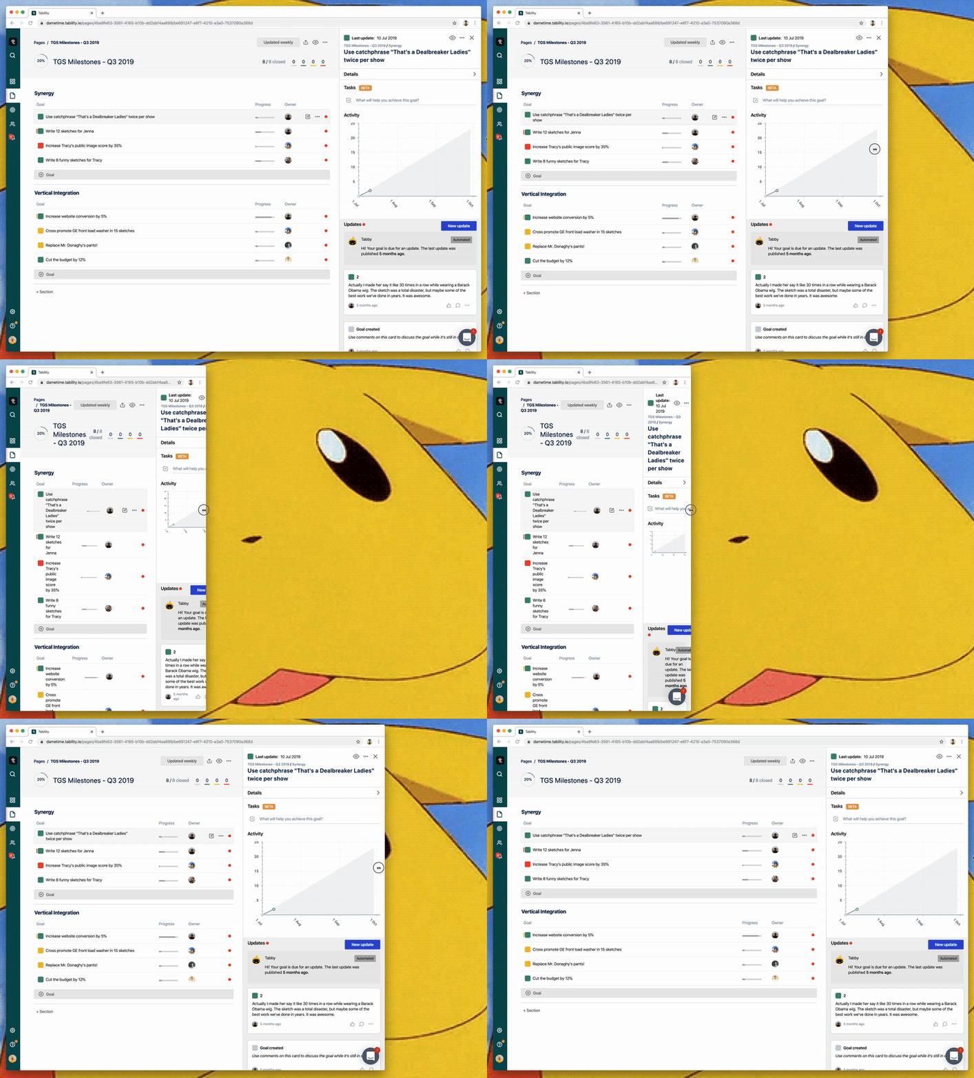
Though it's something we're not proud of, we believe that we prioritized things before this that brought you more value sooner. We've always been aware of this, and it's finally time to address it so you can enjoy the benefits of Tability anywhere.
The vision
As part of this big redesign, we're reimagining how this experience works. We realize there is a major need for this, not only because literally everyone is on their phone literally all the time, but because Tability was really made for this. Imagine this:
As a manager or CEO, you're running from meeting to meeting, and you're never at your desk. You would be able to check in on your team and see how they're progressing on their projects while walking from one meeting to the other.
As a contributor or team member, you can check in and do all of your updates on your way into to work in the morning. You could even stop at your favorite cafe on the way to work, and stop to have a cup while you update your goals on your phone.
One of our main goals for building Tability, is to help you work less. We want you to be in our app as little as possible, while gaining incredible value to help get you the outcomes you want. To do this, convenience is incredibly vital.
Design solution
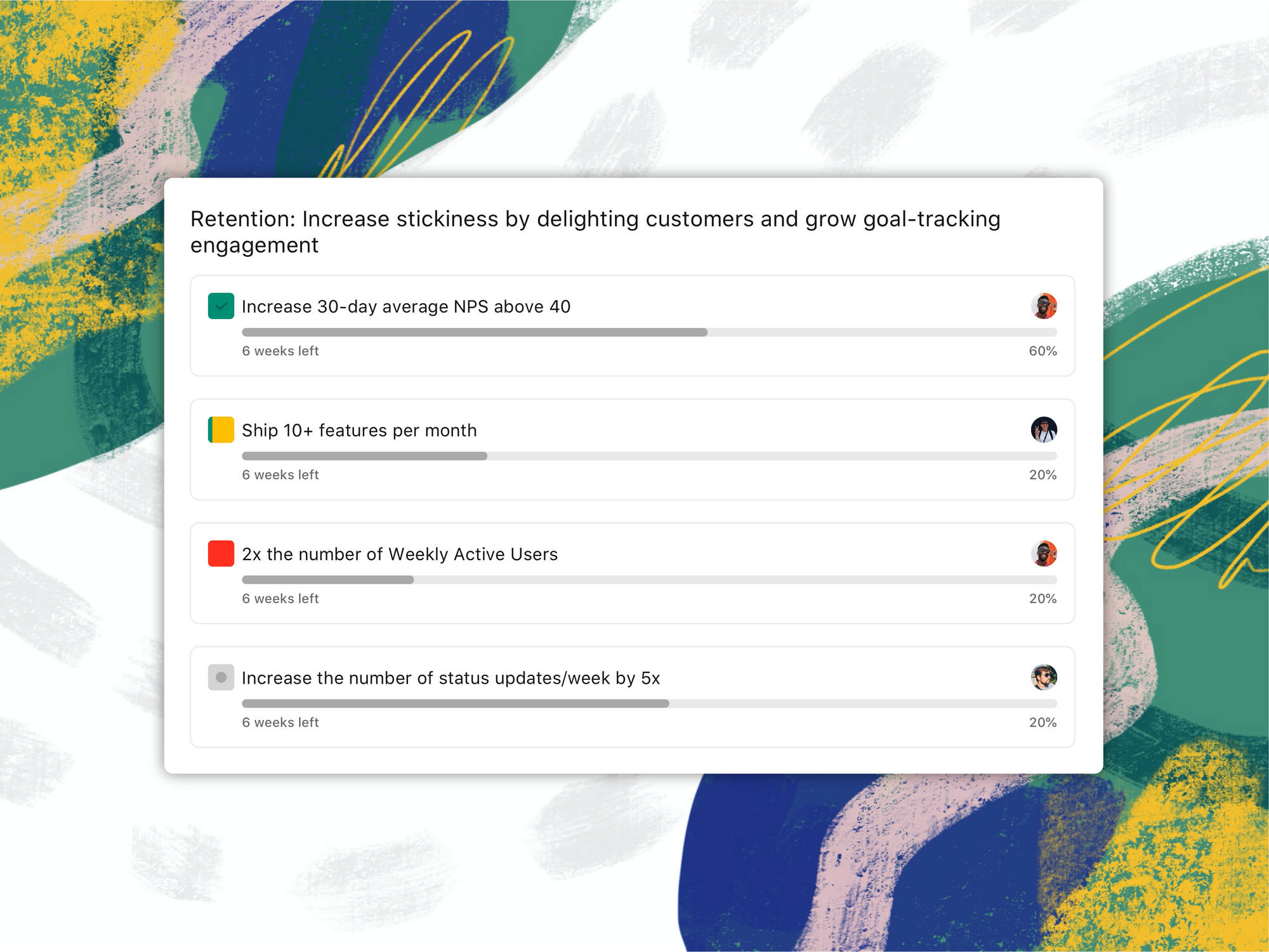
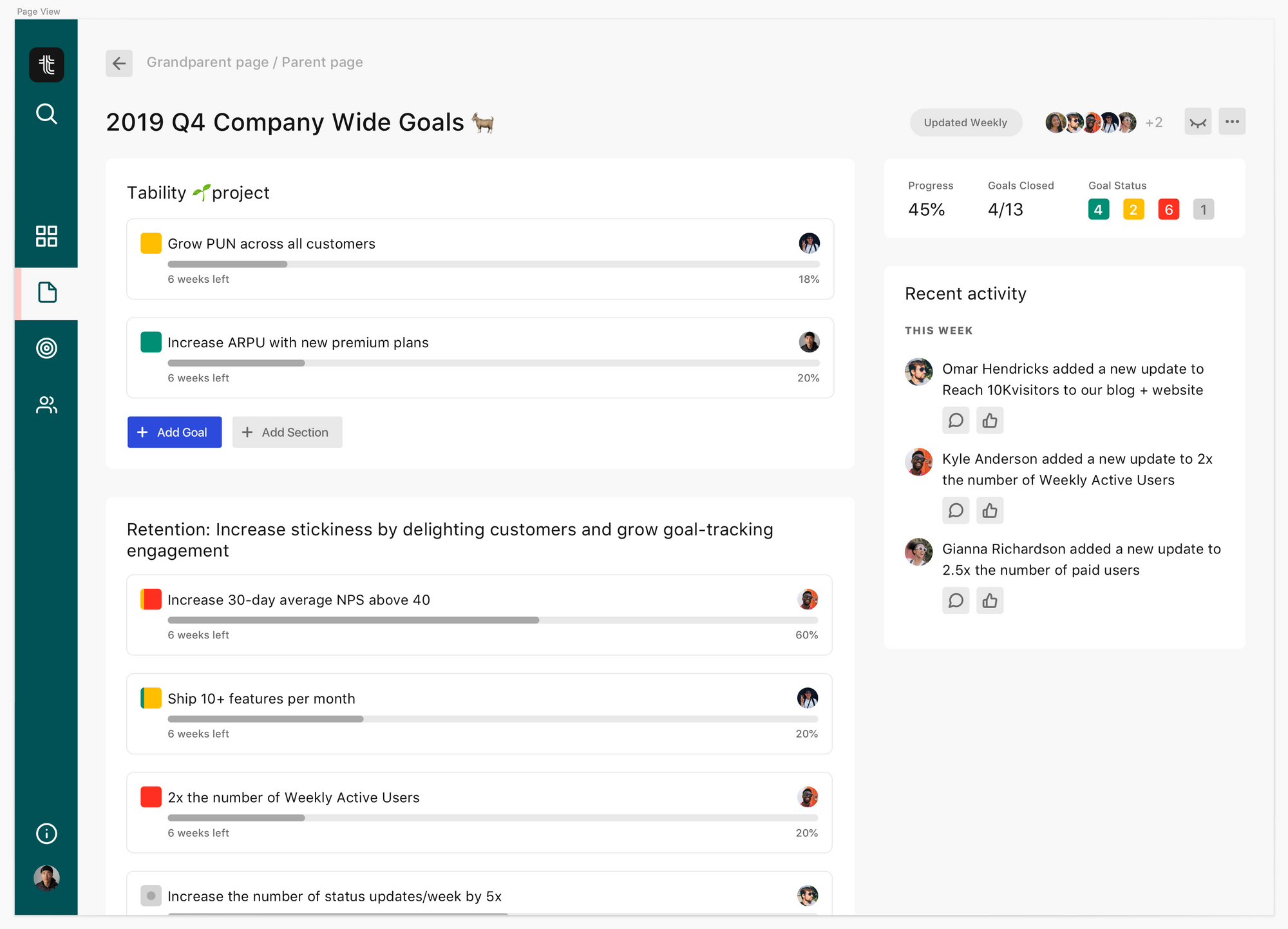
As you can see in the gif above, the app just has no scalability in it's components. In the new design, we're starting at with making each element scalable, before thinking about it at the page level. Here is the new goal design:

Now you can see the same goal design on your web app, as you will on your mobile and tablet as well. We're applying this same flexibility-first mentality to every component - pages, goals, updates, etc. - and you'll soon be able to open your Tability workspace anywhere on anything.
A Temporary Fix
If you're a CEO, manager, or a contributor already using Tability, some features are already available to you via our mobile companion app (available now!).
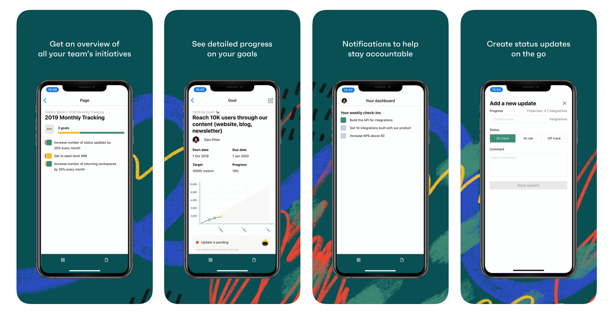
What you can do now:
- Update your goals on the go. Access to your dashboard so you know what you need to update this week.
- Access to all pages, so you can flip through all the pages you care about and see how all the goals are progressing.
What you can't do (yet):
- Create new pages and new goals. You'll have to set your workspace up on our web app for now.
- Some missing goal details - no tasks, links, or details - but we will be adding more compatibility soon!
If you'd like to try it, it's available for download now in the app store. Please let us know what you think of it. We're working on new features every day, so you expect a full Tability experience soon!

