Designing Tability — April update
Some updates to our UI design as well as some learnings of a first time UX and interaction designer.

I’ve been at Tability now for about 6 months and I’ve been meaning to start writing up regular design updates to share a bit more about what we do on the design side of things. Stay tuned for more regular updates going forward ✨
First off, when I worked at Atlassian, I worked on the branding and marketing side, focusing mainly on our web properties, customer events, marketing campaigns etc. I never really had to work on anything under the hood…
I’m definitely not putting down web design because it has it’s own challenges, but for me, I was definitely naive about the intricacies of interaction and UX design in a product.
At Tability, I’ve jumped in and become all four non-Stewie members of this Family Guy household and have been learning so much on-the-go about all these other design practices. I hope that these some of my learnings can be useful to other designers going from graphic/web design into interaction and UX and UI, or at least a conversation starter, as I find my way through designing Tability.
What’s New
I’m stoked to talk about some of the updates to our UI because I feel like we’re really getting to a good place with it. The app has improved heaps this past month from an interaction and UI stand point. We’ve shipped a lot of new designs with major upgrades in information layout, upgrades to navigation, and new button style.
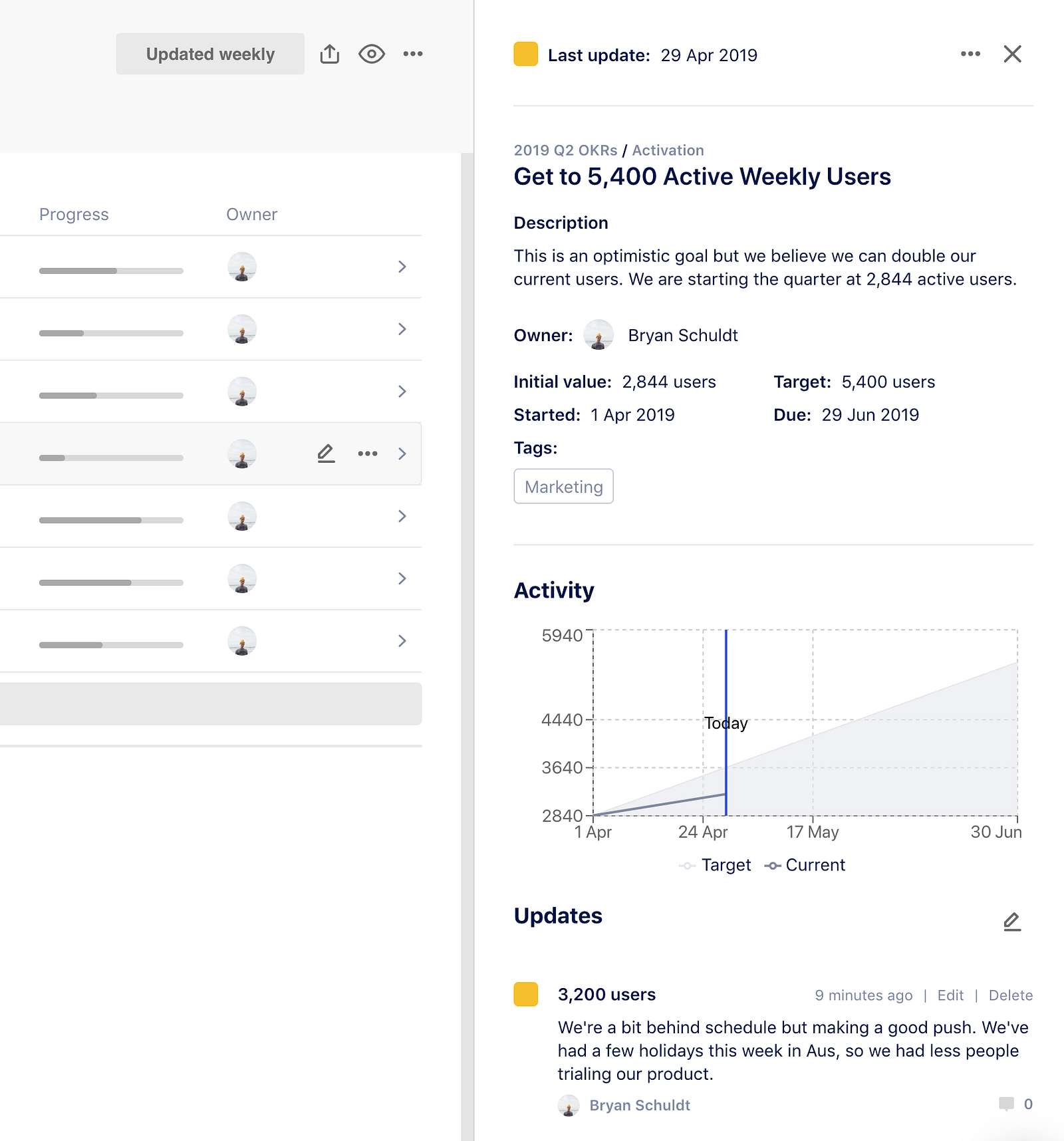
We’ve gone back and cleaned up our goal details panel, so that the information is easier to read and makes more sense. It was a low hanging fruit but something we rushed through in our initial build and needed to revisit. Now all the goal information is grouped together at the top and all activity information grouped below that to easily scan for historical context.
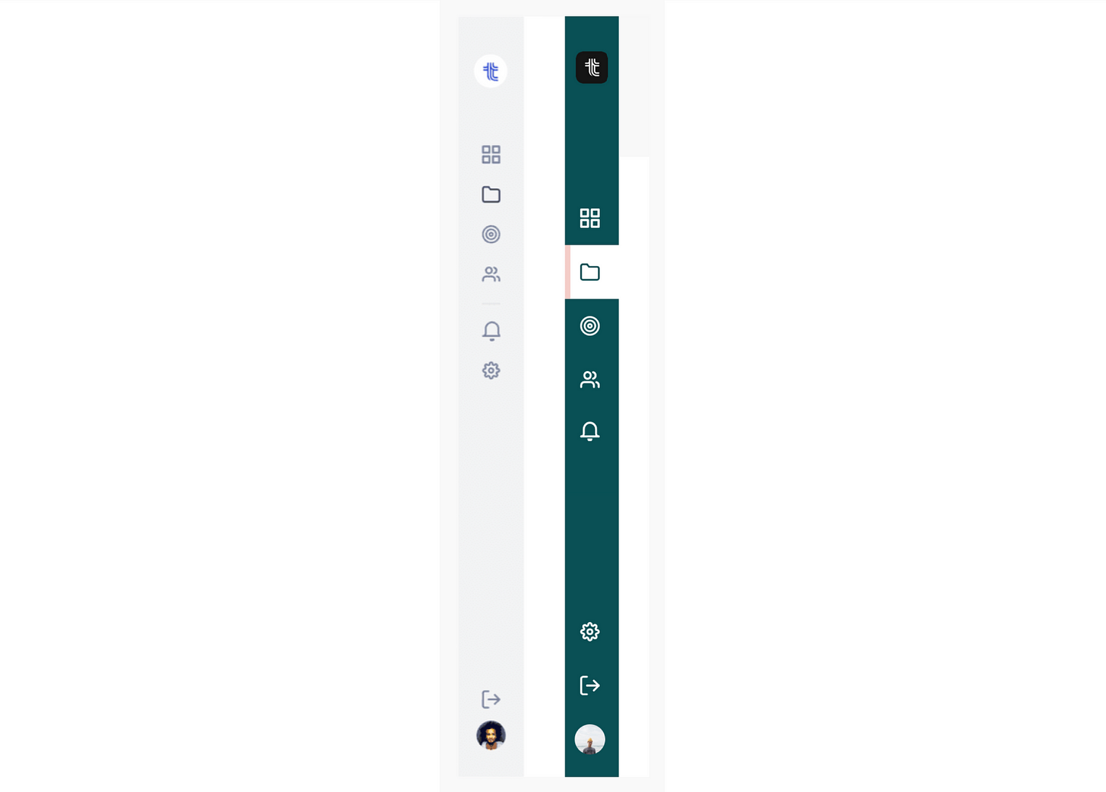
Another update we made this month was to change the color of our side navigation. We originally had it as a neutral grey color, as not to distract from our green, yellow, and red status icons for goals. One of our value props as a product was the scan-ability of those status icons and the health of your goals. We’ve since sort of gut checked ourselves on our decision and, for so many reasons, it made sense to change the color to green.
The problem that drove this design change was having to separate different types of settings within the app. With the new green nav, we can have a green background for navigation in the workspace settings and have a grey background for navigation in project and profile settings. Now it’s clear what pages are for admin and which are not.
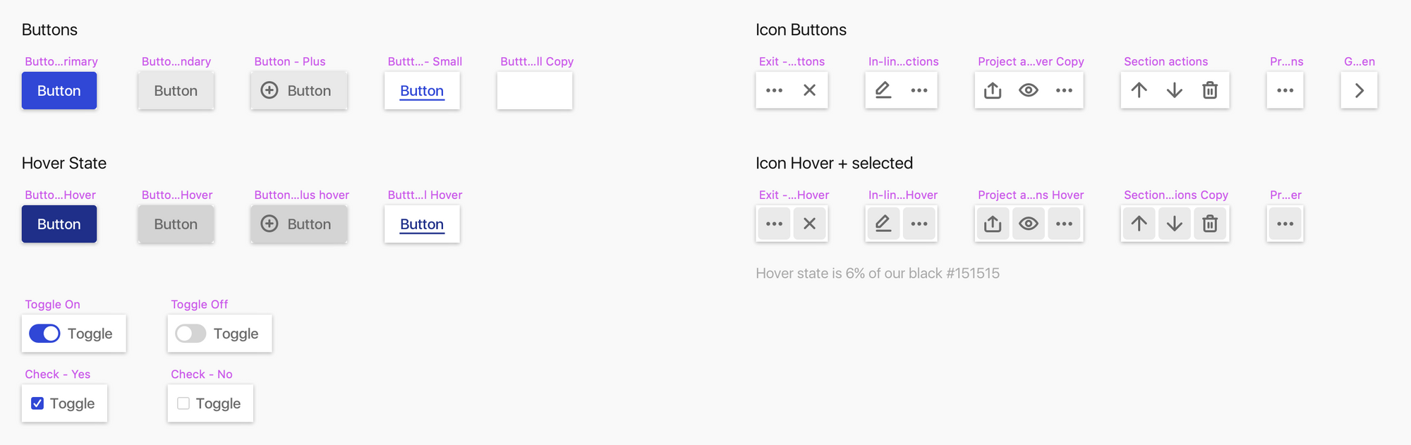
We’ve gone back and taken another look at our buttons. As we approached the end of the quarter, we had issues with users not being able to locate where to close a goal. It was a buried a few clicks, so we wanted to bring it up and make it easier to access. In fact all goal actions other than update were buried.
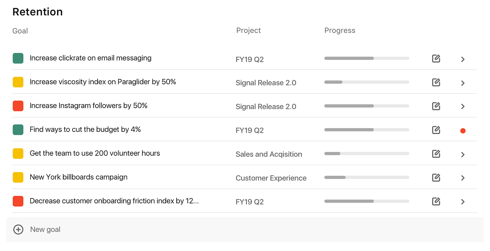
The only action you could take here was to update a goal through the small pencil icon on the right. To close a goal you had to open the goal details, click the pulldown at the top right, then you could click close goal. I’m sure this is true with any app, but with so many actions and info on one page, that horizontal real estate becomes a real tight constraint.
As the graphic designer turned interaction designer, this is where I had an epiphany of how to solve new UX and UI problems with things that can’t be designed with a static sketch file. I was inspired by something on Slack:
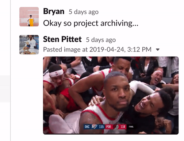
Check out this small interaction that happens when you hover over a Slack message. Without taking up real estate or over crowding the UI, this little interaction brings ALL the major actions up to the front of a UI space. So we shipped a similar thing where your actions appear on a hover.
Now you still can add an update easily, but also have access to every goal action right in there in the list view. It’s probably a no brainer for a seasoned UX or Interaction designer, but for me, this was a big win and a learning moment. A simple hover and reveal was a big step for making the UI more interactive and the UX more intuitive.
That’s not the end of it though. We’ve started to implement these button and interactions across the entire app, making it a more consistent and intuitive experience anywhere you have to take an action.
Be on the look out for more design updates soon, we have a lot of things in the queue on our public Product Roadmap (this is the actual board we work off of!). Like always, please leave us feedback and what you’d like to see from Tability next.
PS: We are currently looking for people to test out our product. If you would be willing to do some user testing sessions with us, please let us know. We would love to get your input! 🙇🏻♂️