Designing Tability – June Update
Introducing a few new features to make goal tracking more engaging and intuitive

6 months since the launch of Tability, one of the biggest difficulties of designing this app is that the lifecycle of goals can be really long. Like many of you, we plan our goals out on a quarterly cycle, which means a lot of times we don't see the full behavior of a goal for... 3 months? This has forced us into a learning process that sometimes takes just as long – for example, we don't get feedback about the goal closing experience until it's time to close a goal, 3 months into your goal tracking process.
Your feedback has been immensely useful and constructive, and the truth is, we're using the product right alongside you. We notice things that are wrong with it probably around the time you get to it too. So any joy or pain-points you experience through your journey with Tability, we're right there with you and want the best possible experience for all of us. We try and fix any issues as soon they come up, so thank you all for your wonderful feedback along the way.

So you may have noticed some big face-lifts in some of the product UI over the past week or two. As we were approaching the end Q2 and we were beginning our planning for Q3, we noticed some key features missing. There was no where for us to discuss or review our upcoming goals. The only way you could comment on a goal or leave a note was when there was already an update made, which in this case would not happen for a few more weeks (one week after the start of the quarter, theoretically). So we added a feature.
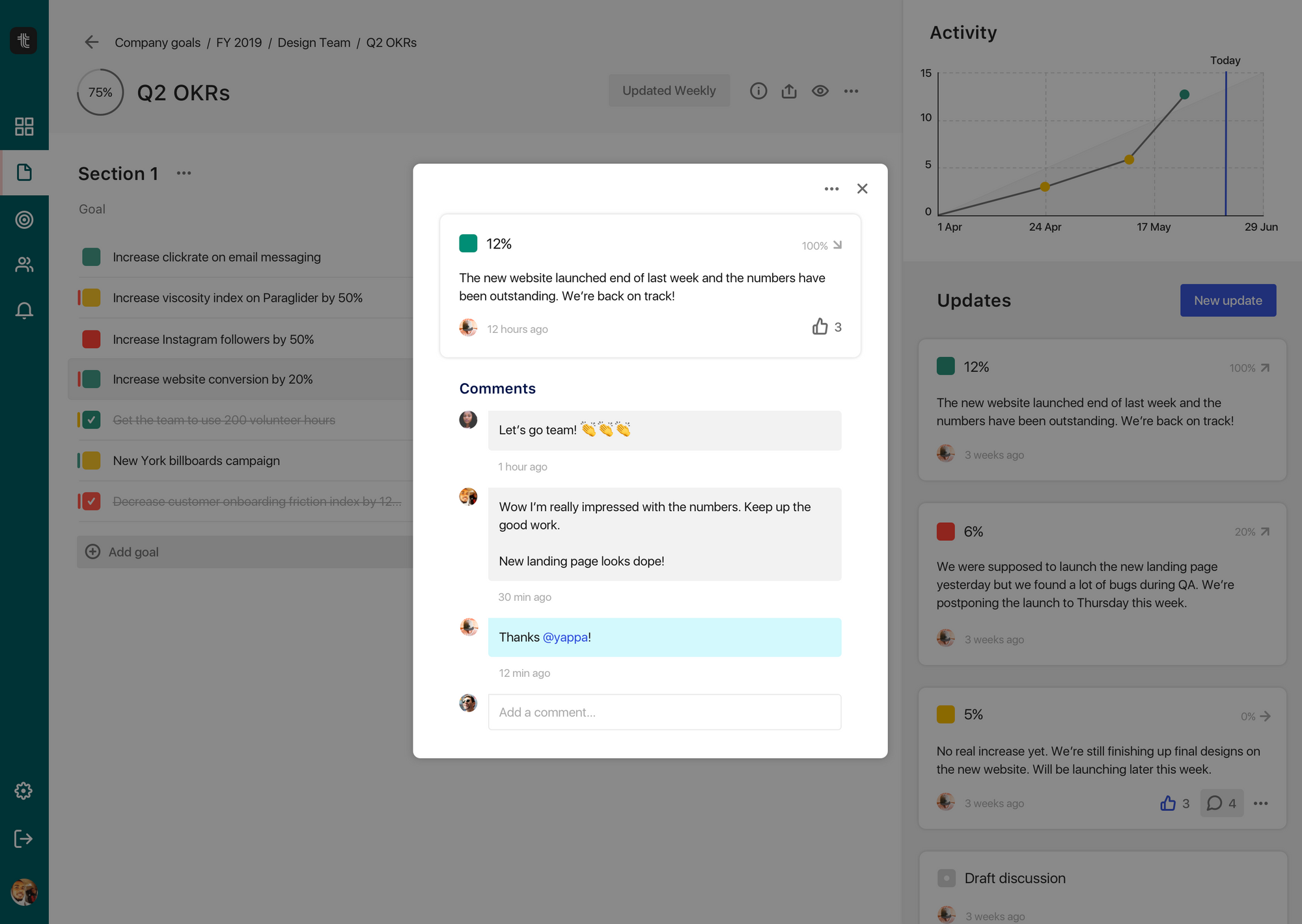
Now, you can comment on a goal before it even starts. If you're in a manager role, you can review your team's goals before the start date and discuss whether it can be better or not, or approve it with a simple "👍." All your discussion and tracking is now in one place, in context.
Not only that, you might also notice that the goal panel has a totally new look. Part of the drive for this redesign was to house all the new features we want to add to updates. It's more interactive than ever before and it just wasn't originally designed to house these actions.
The other part of this move was for consistency. We prioritize simplicity and a good user experience when using our product. Part of that is having actions make sense, so you don't struggle to do simple tasks in our app, or have to relearn different interactions for the same types of tasks. When we heard some feedback from a customer having issues finding an action, we knew we had missed a few spots.
Noticed today that you guys have turned the update goal button into an icon.
I had trouble finding it, especially because 1. I open Tability only about once a week and go straight to update goals 2. The button appears momentarily when you open a goal for the first time in the session and then it goes away ... and I'm like .. what happened?
We realized we had a big blue CTA to update goals when a goal was new, but not when it had at least one update already. We cleared up that confusion and just made that the default.
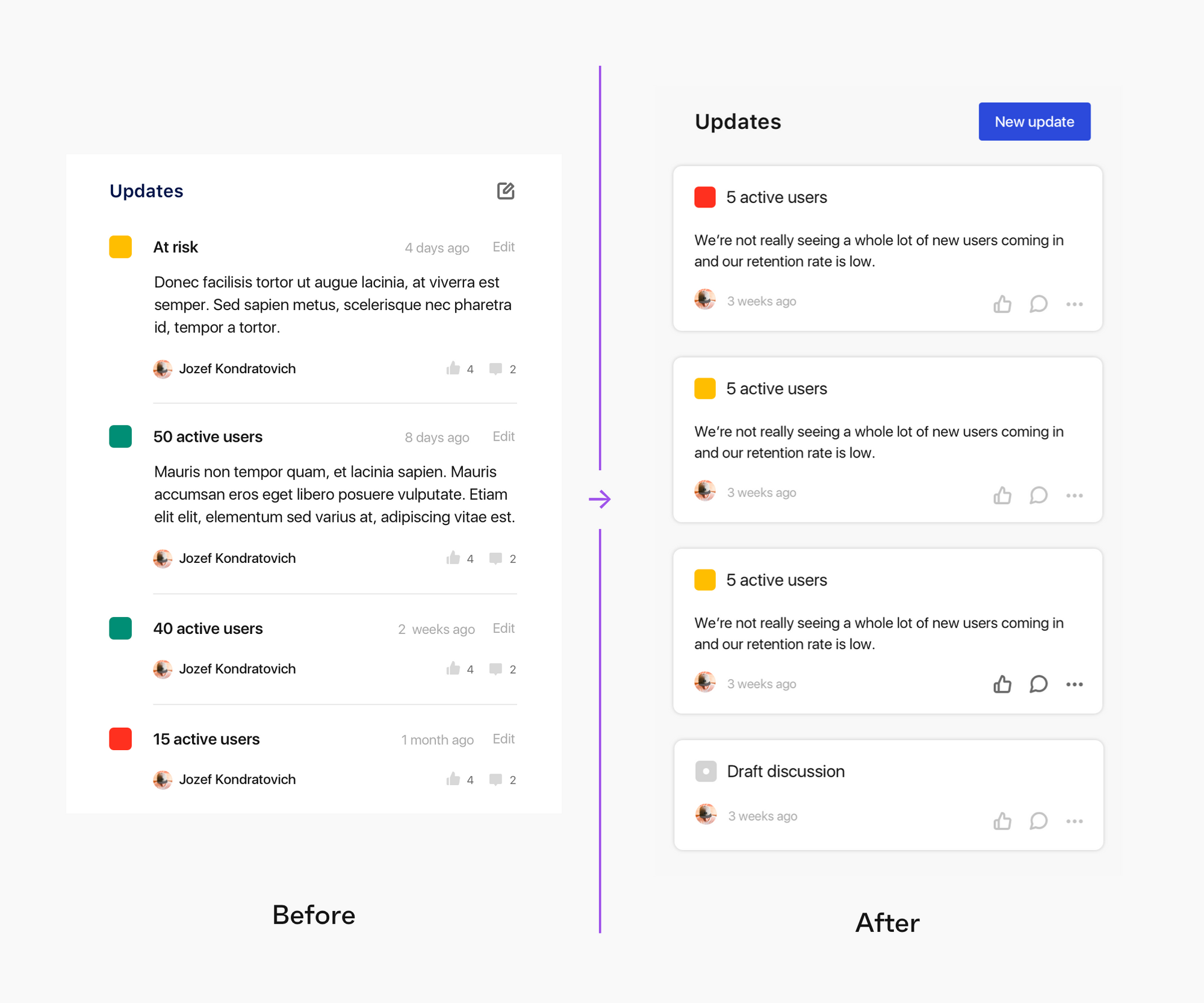
Inside the new update cards is a whole load of new actions too. Like you saw with Draft Discussions, you can do the same thing with all updates now. Now when you post an update you and your team can have conversations, send instant feedback, maintain context, and celebrate wins all in a single update card. Go in the app and check it out for yourself! 🥳
Now that we're entering Q3, we're excited to see how our own goal tracking process with Tability has improved from Q1 and Q2. It's a long process, but like your most important goals, we're building and working towards a better app, gradually but surely. As always, please check out our Product Roadmap and add your ideas and feedback.
Thanks for being on this ride with us – more new features to come. Stay tuned!
✌️