4 Types of Outcomes and Key Results
We don't always want to see a metric increase, sometimes we want it to go down... or stay the same. Here's how you can use the Tability progress chart to track your metrics correctly.

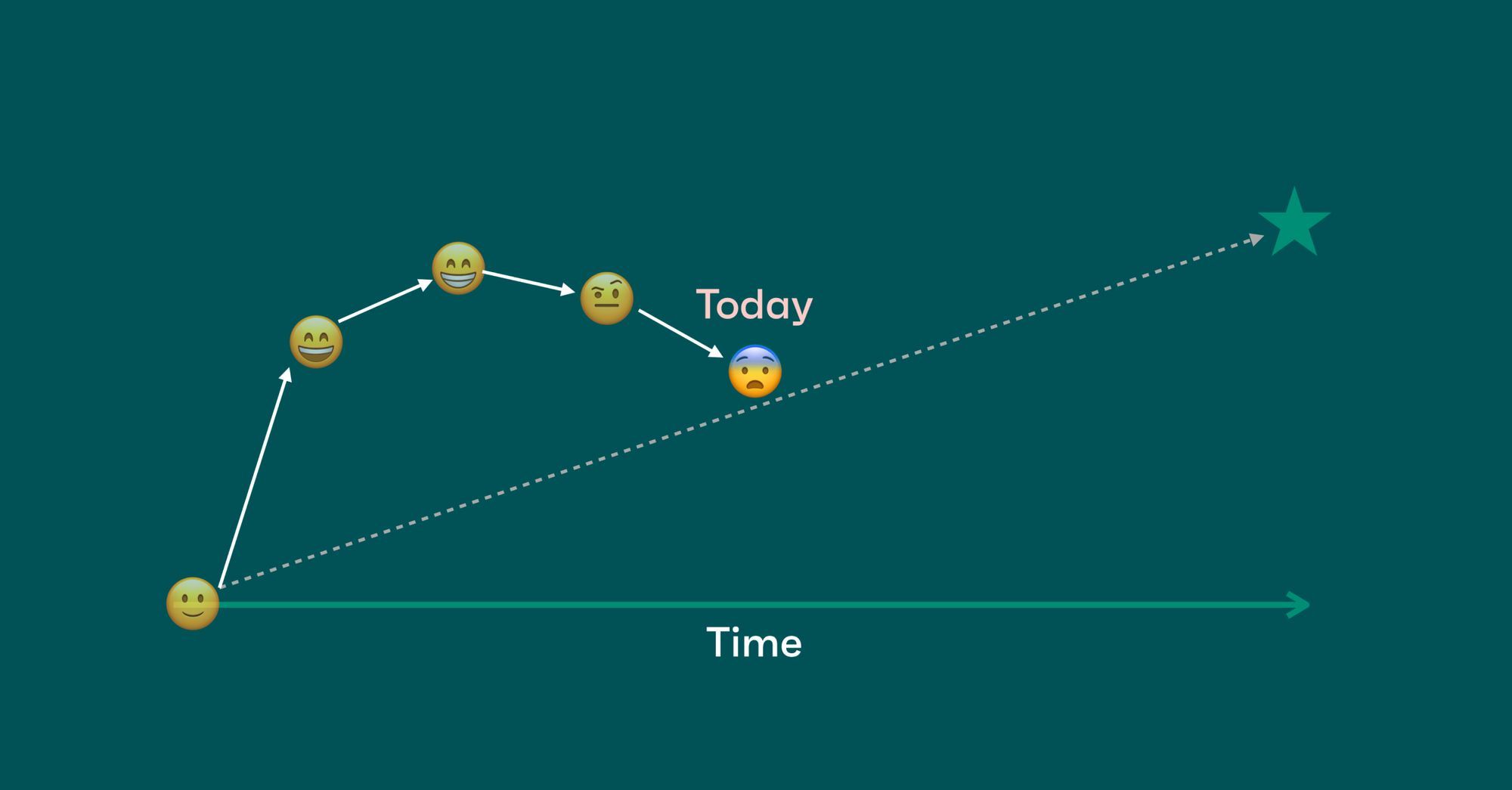
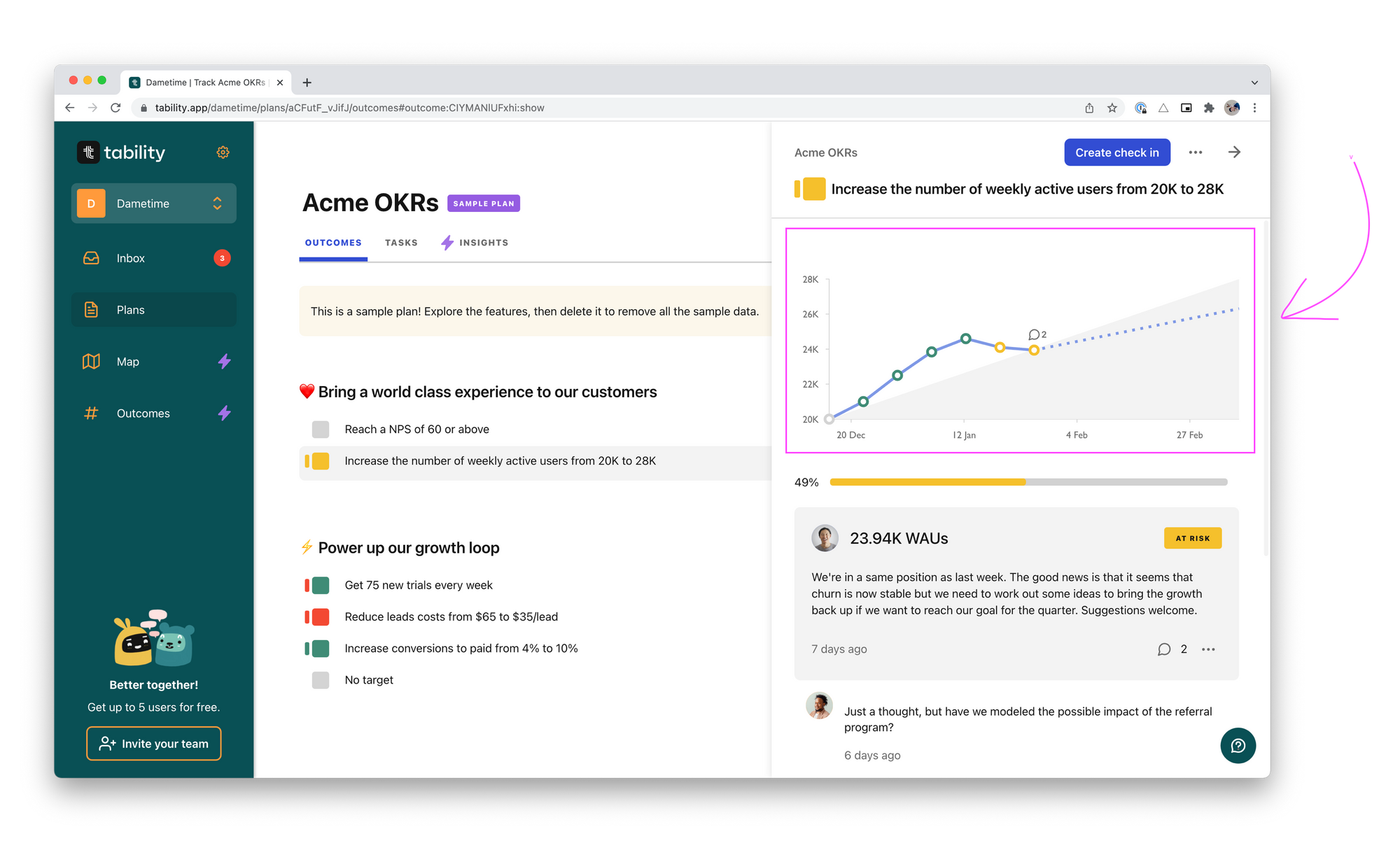
One of the most powerful features in Tability is the progress chart – a visualization of your progress and trajectory. It may seem like a small thing, but you don't realize how much of the full picture you're missing until you see the before and after.
(See: Weekly ritual for OKRs)
The progress chart in Tability shows you trends of past weeks, how far you are from start to finish, and your trajectory based on your past weeks trend. You can compare that to the shaded area - an estimation path of start to finish. You often have a starting point and an end point that’s in an upwards curve (See the shaded area, going from bottom left to top right).
But not all outcomes go from small to big. Sometimes the outcomes you’re looking for is decreasing or trying to keep a value above a certain level. You can achieve these types of charts by changing the start value and target value on an outcome.
Increasing Outcomes
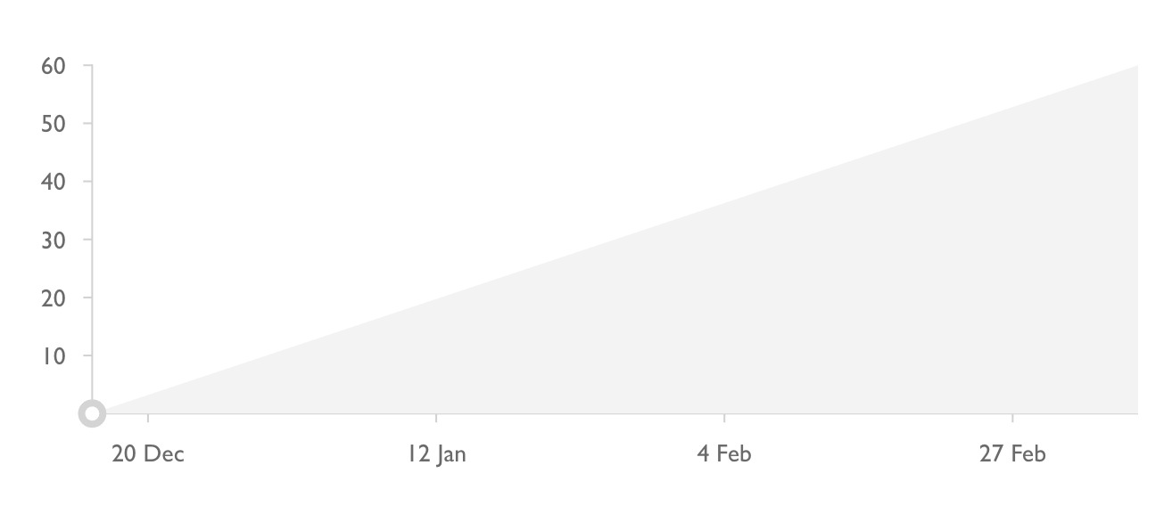
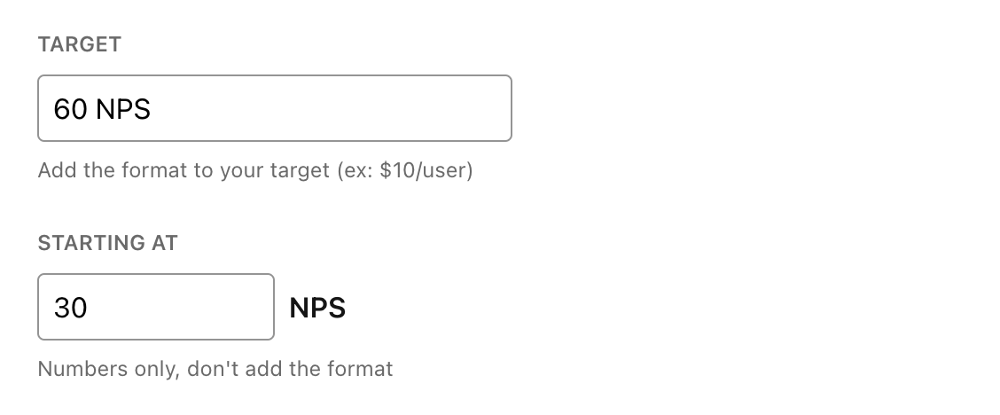
Like the example above, we have an outcome where we’re starting at 30 NPS (Net Promoter Score) with a target of 60 NPS. As shown in the chart, the shaded gray area goes has an upward growth, going from 30→60.
Pretty straight forward and most times you’ll have a graph that’s shaped like so.
Example outcomes:
- Double our number of customers (35 → 70 customers)
- Increase our site traffic by 30% (1100 → 1430 weekly visitors)
- 20 customer demo per week (0 → 240 customer demos) - that's 20x12 weeks!
Threshold or Flat Outcomes
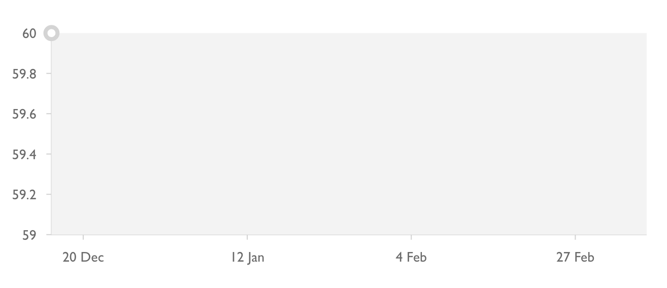
The next example is the flat progress chart. You’ll see that the shaded area is straight across in this one. This can be a useful visual when looking to stay under or above a certain threshold. You can achieve this view by setting both the start value and target value as the same number.
Example outcomes:
- Keep our Net Promoter Score above 60 (60 → 60 NPS)
- 20 customer demo per week (20→20 customer demos) - same example different way to measure!
Decreasing Outcomes
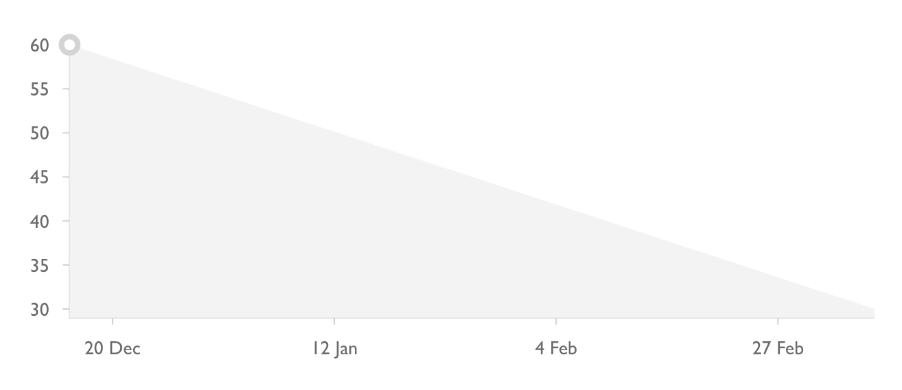
Now the downwards chart. Sometimes you want less of something, and this is where this view makes sense. You might get the idea by now, but you can achieve this chart by making your target value lower than your start value.
Example outcomes:
- Decrease our weekly churn from 4 users to 1 (4→1 users churned)
- Reduce load times on website to be under 1 second (2.35→1 second)
- Average response to support message under 1 hr (180→60 min)
Bonus: Outcomes with no target
Some may disagree with us on this on this, but you can also have Outcomes or Key Results that aren't measurable.
To do this in Tability, go to your target value and leave the text box blank. Tability recognizes this as an outcome with no target, and will create a simplified timeline displaying just your confidence levels. You may see just a blank timeline, but over time it will be filled in like this:
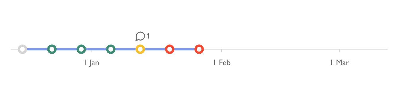
Though an outcome with no target may be rare in OKRs, it can be quite useful. Sometimes you really just need to have a weekly check-in to make sure you're on track with a certain project. This helps you to get reminders, keep notes on what happens on a weekly basis, and keep the project at the top of your priorities.
Want to see more of what Tability has to offer? Book a free demo with us! We can help you get set up with OKRs in a way that really works for you.