New UI coming soon
No new features this week as we're putting our efforts to a sleek new redesign. See what's coming in the fresh new Tability UI,
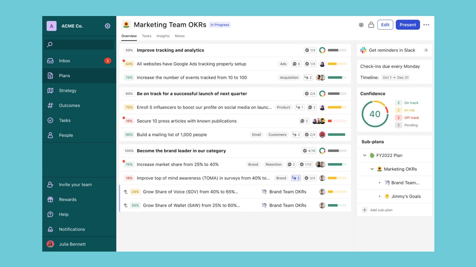
No new features to announce this week as we're right in the middle of a big redesign across the site! So instead of our usual Feature Roundup, we're going to be talking about a bigger better Tability redesign that's coming soon ✨ Now don't worry, we won't be changing any major functionalities, or removing any features — but we think the new look and feel will make a HUGE difference.
Let's dive in 🐬
Redesign Goals
We had three things in mind going into this redesign:
- Make the platform more mobile-friendly
- Show you more information at a glance
- Make the information feel less cramped esp. for those on smaller laptop screens
Done: Taking back some white space
The first step to our redesign was to simply get back some white space:
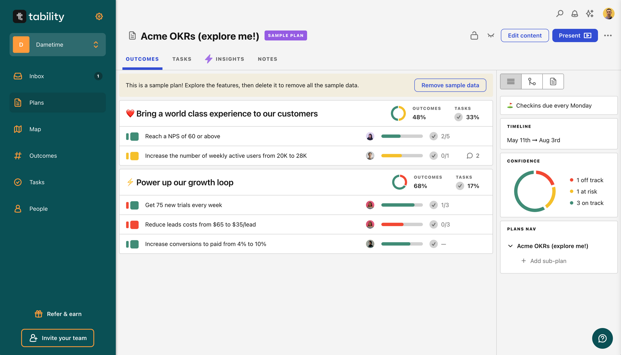
We tightened up some padding, decreased some text and icon sizes to fit together cleaner and cleaned up our rounded corners. It was surprising to see how much of a difference this already made in making more things visible on a smaller browser window.
We've already implemented these changes and this version above is currently live in the app.
Next: Smarter Outcomes
Quite often you think of mobile friendly as a problem of how to make things smaller and fit into a tighter space. However, this time around, we're also thinking about what happens when you go bigger too. Now we still optimize for the average screen size, but if there is more information we can display on one view that can be helpful, why not!?
With the new design, outcomes will reveal more information depending on your screen size.
More to come: Easy align and Tasks in context
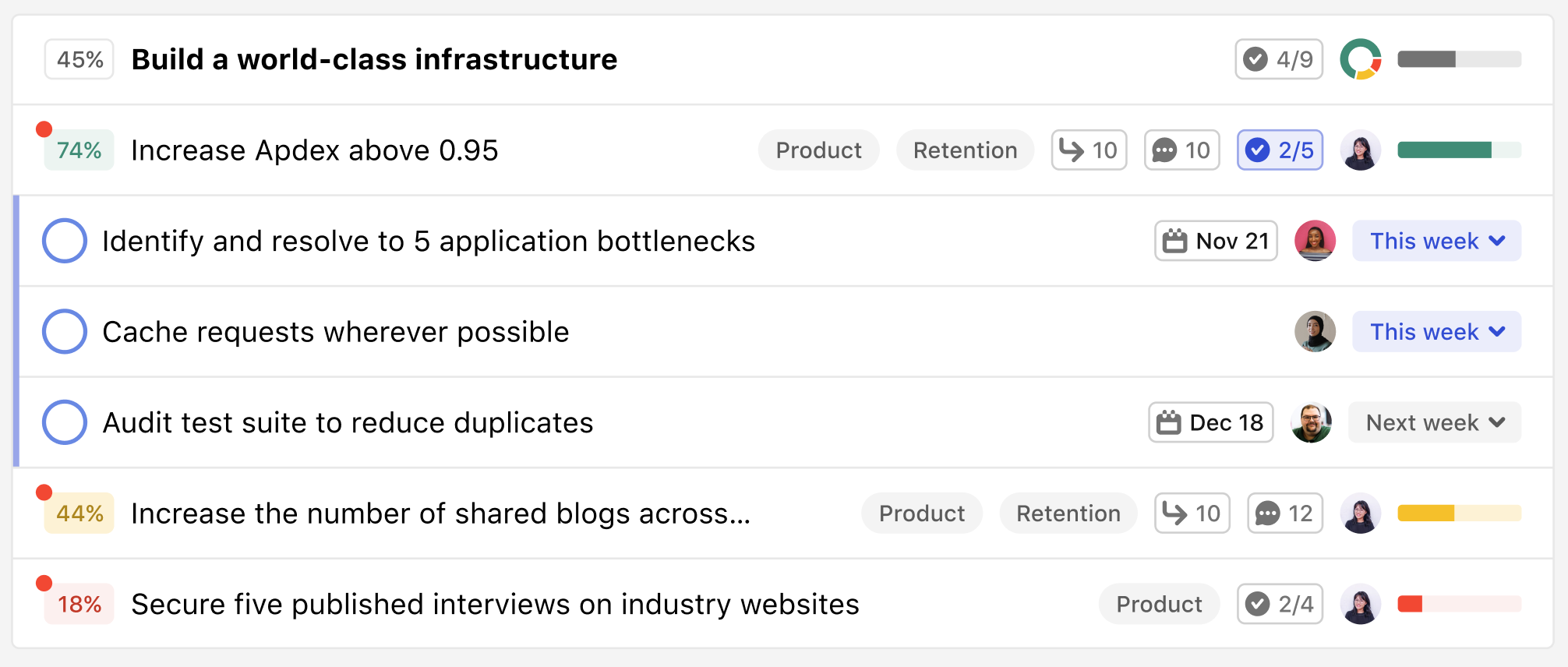
Now having all these new components to play with got us thinking about better and bigger features that we could add too. We're adding a counter for aligned outcomes next to where the tasks counter is displayed now, which you'll be able to click and expand out to show aligned outcomes or tasks in context to the plan you're looking at (look close at the video above and you'll see the outcome alignment 👀).
Here's what it looks like with Tasks:
The final upgrade: Fresh designs all around
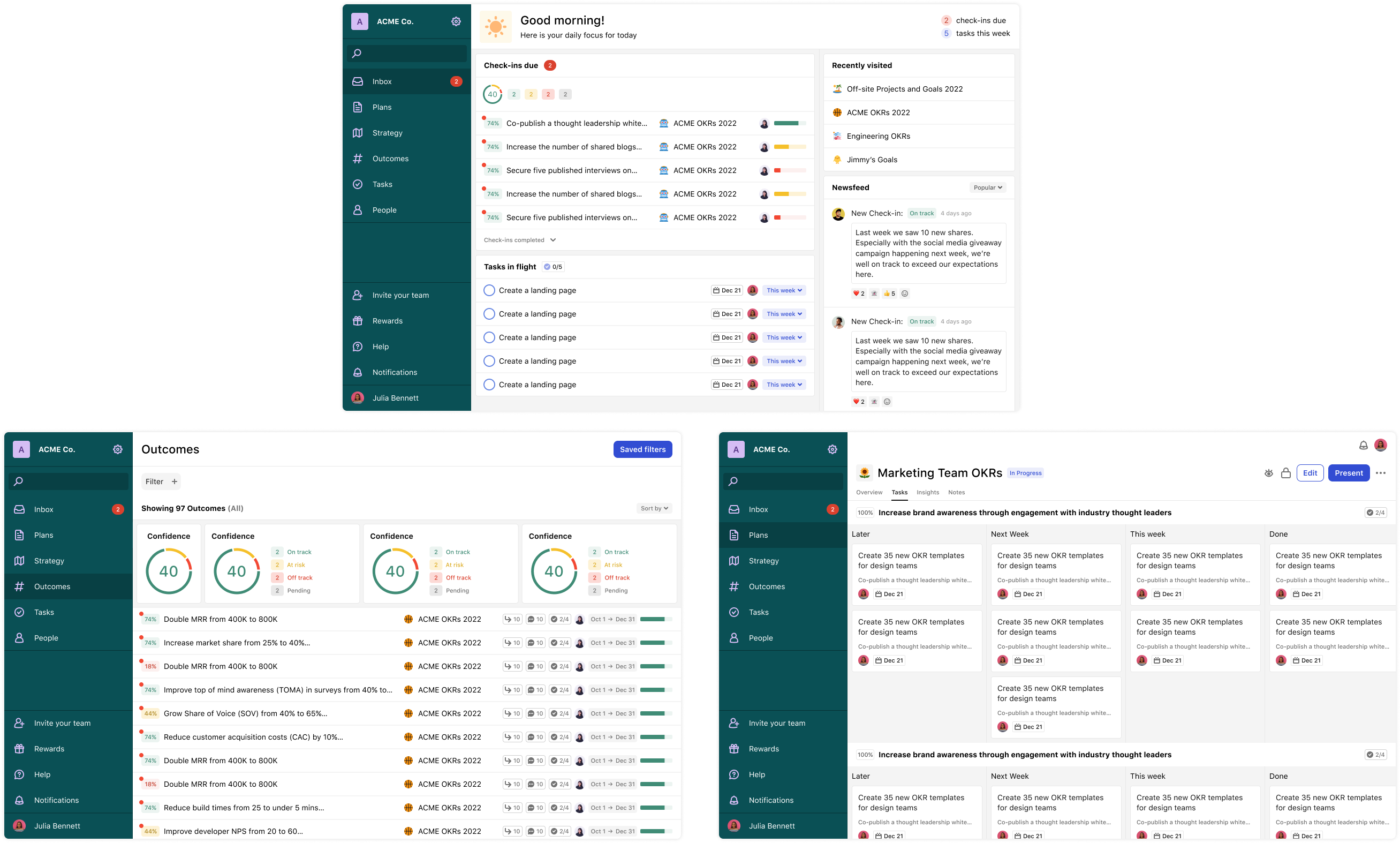
We're starting with our plans view first and rolling out these designs to the entire app for a fresh new look everywhere. There's more and more on the way so stay tuned!
We'd love to hear from you!
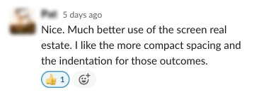
The wonderful folks over in our Tability Slack Community have already heard about these updates and everyday they provide the feedback and suggestions that help improve Tability little by little! If you have feedback or questions about anything Tability, join the conversation!
❤️ ❤️ ❤️

