OKRs for UX Design

Update: We have a new library of OKRs templates at https://tability.app/templates/design
Design is subjective.
Quantifying it and trying to measure it is an uphill battle from the start. Quite often you find a few metrics to track, but they don't really capture the whole experience. The results are more often than not, vague. So why bother?
A few reasons why your design team (and everyone) should do it:
- OKRs help teams become more Outcome-driven. Rather than thinking about success in terms of projects and releases, it helps you understand your value to the company.
- Backing your work in quantifiable successes helps validate the work you are doing, and give leverage to further work you would like to do.
- Design is a mysterious language to every other team in your org; talking about how your design work affects their MRR or retention rates helps you all talk about projects on the same page.
- Designers and Developers are often the end of the supply chain, and their work process can feel like an endless backlog of tasks. Attaching those tasks to an Outcome gives the work a point of reference that makes it feel more meaningful. It empowers everyone to do more meaningful work because they can see directly how their work affects the company's progress.
There are many many reasons why all teams should start working toward Outcomes instead of projects and releases. It's easier said than done.
Here are a few tricks to help you get started on design Outcomes.
Every team has different goals
Like anything else, you probably start by Googling: How to do design OKRs. The problem with this is there is no unified success story on how to do this.
This is because success looks different for everyone.
There are several steps to take before even considering OKRs.
10 things you can do before OKRs.
— Tability (@tabilityio) March 31, 2020
1. Share a vision doc
2. Feature kick-offs
3. Feature Leads
4. Add success metrics to specs
5. Start demos with _why_
6. Weekly review of team goals
7. Bring devs to interviews
8. Relay customer quotes
9. Watch UX tests as a team
10. Run retros
It all starts with understanding your company and what's the best solution for your current problems. Once you have a good understanding of what you're trying to achieve and what success looks like to you, you can start to look at how to solve for those needs.
Spoiler alert: The answer isn't always OKRs.
Structuring your UX goals around Google's HEART method
To be honest, I didn't know where to start. I'm more of a visual designer than a UX designer so it's new territory for me. So I started with Google's HEART framework just to get a sense of what to even track when it comes to UX.
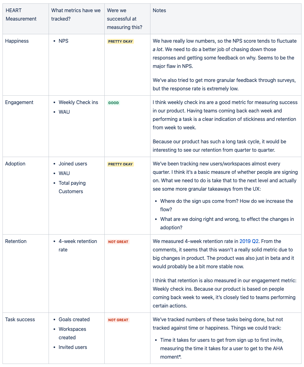
HEART stands for 5 key measurements of a successful UX. Happiness, Engagement, Adoption, Retention, and Task Success. I figured this was a good framework to begin my thinking.
From there I laid out those into a chart like below 👇

With this framework, I started with aligning some of our past goals to these UX values, then made notes on whether we were successful, if it was a good goal, what to change, and what other metrics we should try.
You won't figure out your OKRs on the first cycle. It's important to constantly review the effectiveness of your tracking, and revise.
Focus on a few goals per person
Don't spread yourself thin. Having too many goals is a sure way of getting burnt out and not succeeding at any of them.
I suggest you pick 3-4 at most!
The key is to have focus and make sure you're tracking the best goals you can. Efficiency is the key, not trying to track everything. Some goals are going to be better indicators for success, so find those and track them.
Again, make sure you have continuous feedback for yourself, so you know whether you're tracking a good goal or not, sooner rather than later. If it's bad, ditch it and pick something else.
OKRs are not easy for anybody. It's especially foreign to designers; it's not part of what we do. The benefits of it are definitely there though. Even as a designer, you're part of a bigger company, and the success of that company will always drive your design decisions.
Having direct ownership and effect on a company objective will empower your team to do more and feel the impact they have to the greater whole.

