Introducing: A Brand New Tability
Over the next few months, we're rolling out a new and improved Tability. We will be posting regular updates on the redesign here on our blog, so you can stay informed and add comments/feedback as we go. Stay tuned!

One thing we really pride ourselves on is being a design-led company. Not a lot of founders invest in design as early as we do, and we believe it's helped put us in a more legitimate tier in a sea of start-up productivity tools. We get a lot of comments like this one:


We love to hear that people really do love using our product and that it's easy to use. We pride ourselves on simplicity and ease of use. We don't want to be that complex tool that no one on your team wants to learn how to use.
And we love the nice words, but we're continuously trying to make something better and trying to constantly improve. We know that our product is far from perfect and there's room to improve (and there always will be).

That's why we love getting comments like this one 👆We're extremely fortunate as designers that we live in an age where people will critique your product honestly, to your face (via the internet), in one click. Your feedback and your experience is what informs us on what to work on. Knowing that you think it can be better too is also validation that we're on the right track (set status to green!), and we got work to do.
Coming soon...
So this post is to announce that there are big things coming soon. We got to a point where adding features was making our product UI clunky and overcrowded and duct tape wouldn't fix some experiences that we're built on not-the-best foundation. We decided it's going to take a dramatic change to fix some core things.
Over the next few months, we're rolling out a new and improved Tability. We will be posting regular updates on the redesign here on our blog, so you can stay informed and add comments/feedback as we go.
You'll see:
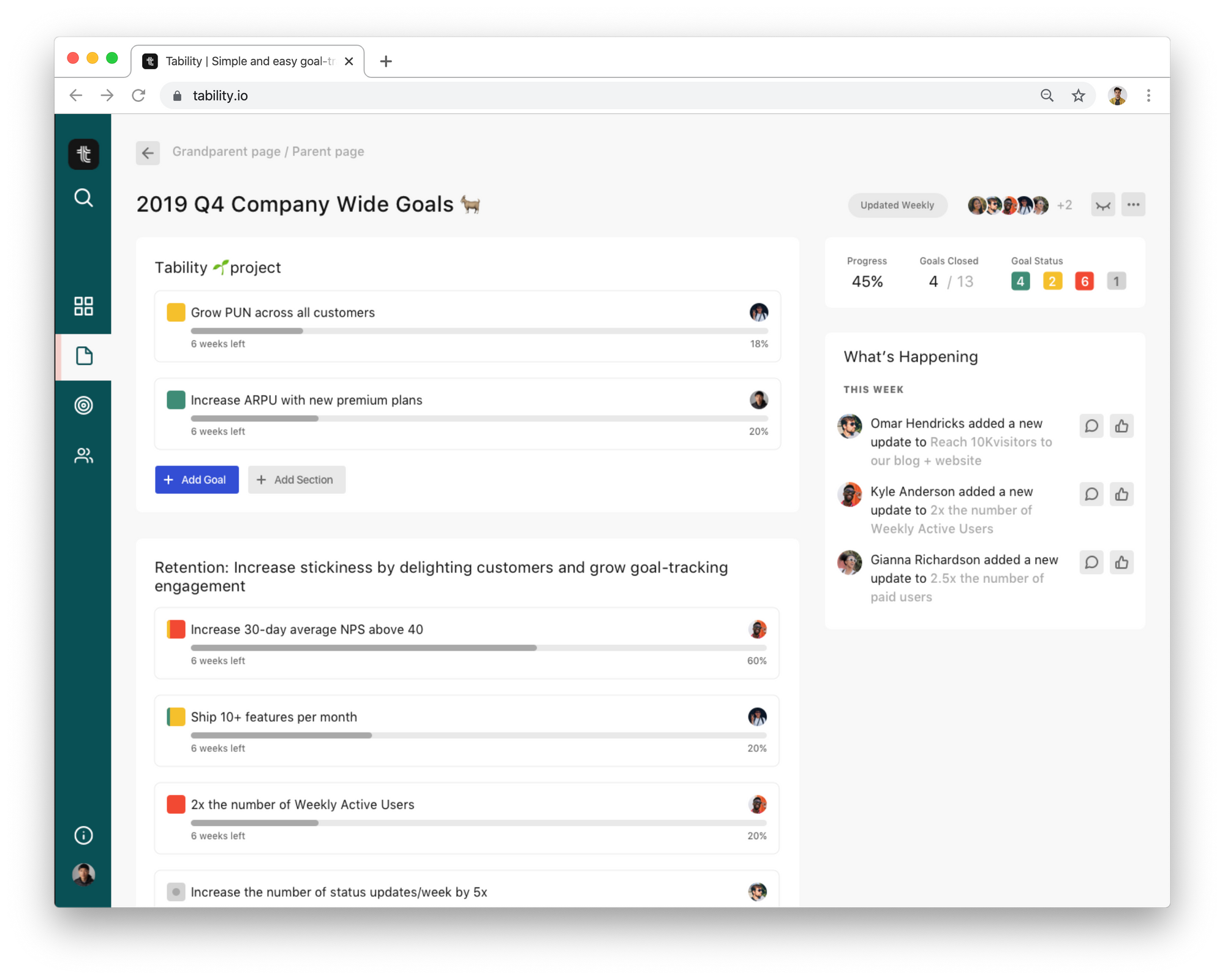
- Reimagined page content on dashboards and pages. More relevant information for you in single views, whether you're a manager or a contributor.
- Simplify without compromising capabilities. A more intuitive UI – the most common tasks in less clicks and the power user features behind more clicks.
- Mobile and web responsiveness! (what year is this? 2013??? 🤨) In fact, earlier this week, we launched our beta for Tability for mobile.
- Three bullet points doesn't properly represent how big this redesign will be so I'll also add: "and more!"
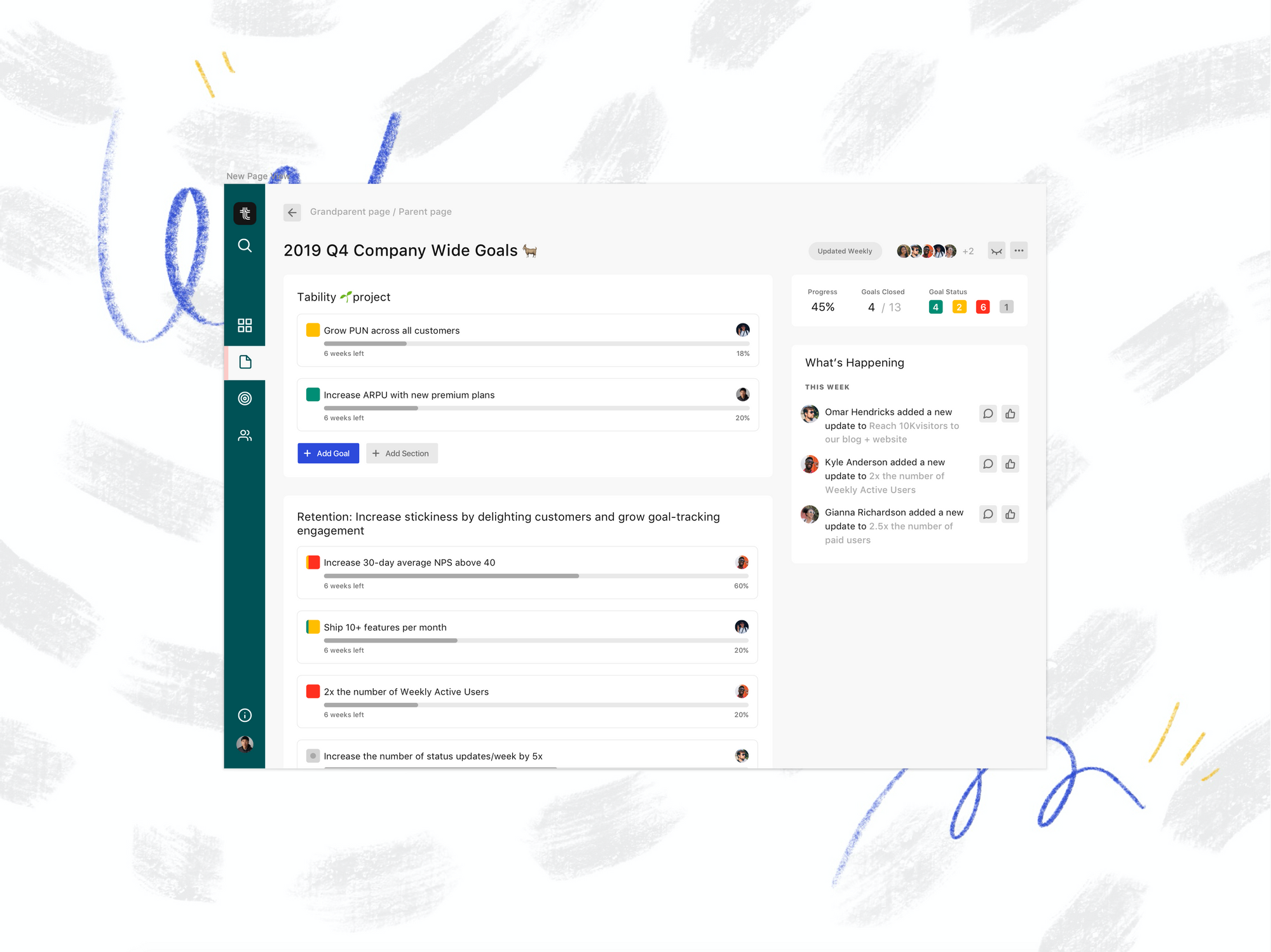
We hope you're just as excited as we are about the things that are coming. As a sneak peak here's what the new page design might look like:

Stay tuned for more new and exciting stuff 💛

