Building Better Brands: Brand Assets Basics

As a start up, what are the basic things you need to help your brand look good and consistent? How do you do it on a bootstrapped budget? There are a few assets you can start with that will:
- Help give some rules to your brand that will keep things consistent
- Give you the tools to explore your brand in many directions without having to build too many assets
A brand color palette
Color can go a long way in keeping a lot of your designs consistent. Not only that, starting with a color palette gives you (or contractors) a starting point for their work. Working within a color palette gives people restrictions that can help them specify and narrow down what they can create.
What are your primary brand colors
Bare minimum, pick a main brand color and an accent color. You can do a lot with just two brand colors and white and black. Keep it simple.
Dropbox is blue, Facebook is blue, Airbnb is a pink-red, Uber is black, Lyft is pink. Every brand has an identifying color, and this is unique to your company. What color best represents you?
Secondary colors
A spectrum of secondary colors comes in really handy for illustration and design work and creating a bit more diversity in your design. We have a main brand color (dark green), a secondary brand color (pink), and 4 accent colors (red, yellow, green, blue), and 3 more specialized accent colors (purple, teal, navy). These last three colors are for special occurrences and used less.
Our product relies on a few key color indicators. Green, Yellow and Red are prominent in our app to show statuses of goals. So we knew that our color palette had to work with those colors as well as some main brand colors that fit our logo and brand (mainly dark green and pink).
I usually start by going to a site like Coolors.
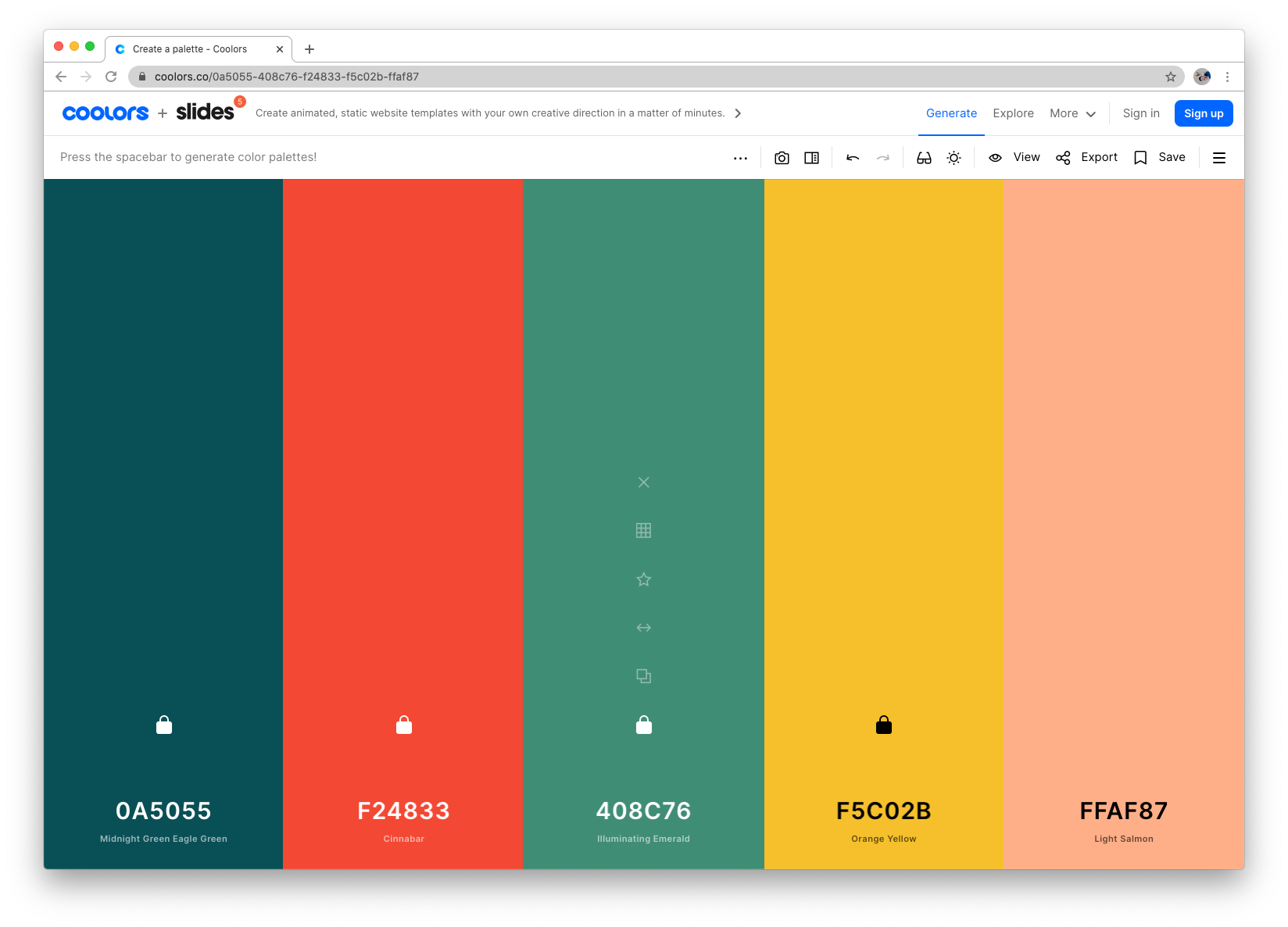
Coolors is a great place to start to find color palettes that interest you. I often pick a color, lock it, and randomize the colors around it. The key to this exercise is to make sure colors don't clash with each other, or I sometimes call it "vibrate." When you look at the edge where the two colors meet, it can be unclear and hard to look at – like it's vibrating. This is a pretty good sign that the colors are clashing.
Eventually you have a selection of colors like this:
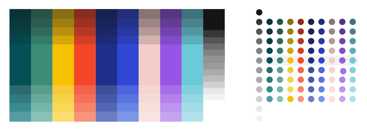
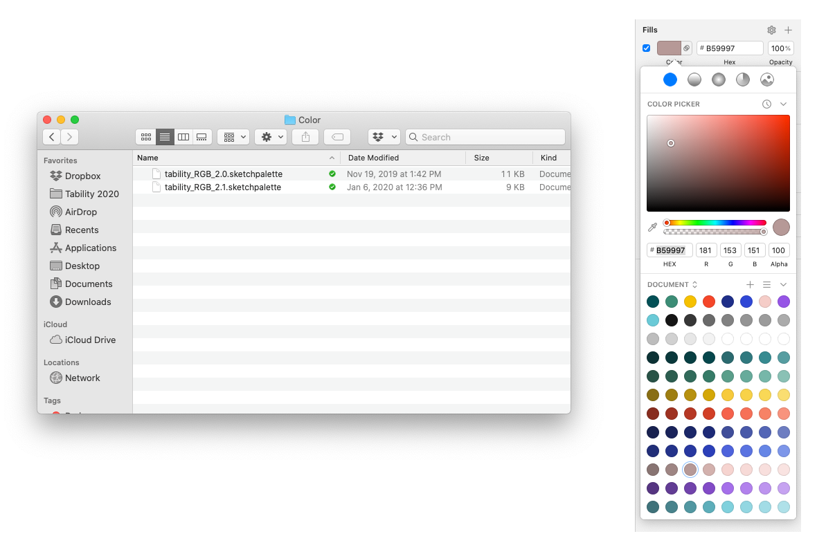
I used Sketch to lay out all the colors into bands. Adding shades to those colors gives you more options in shading and really creating a more option in contrast and illustration styles. On top of those colors, place increasing opacities of white and black until you have a spectrum of colors, that each have enough contrast from the color above or below. Out of those 9 main colors, I created a diverse palette of 72 colors and shades.
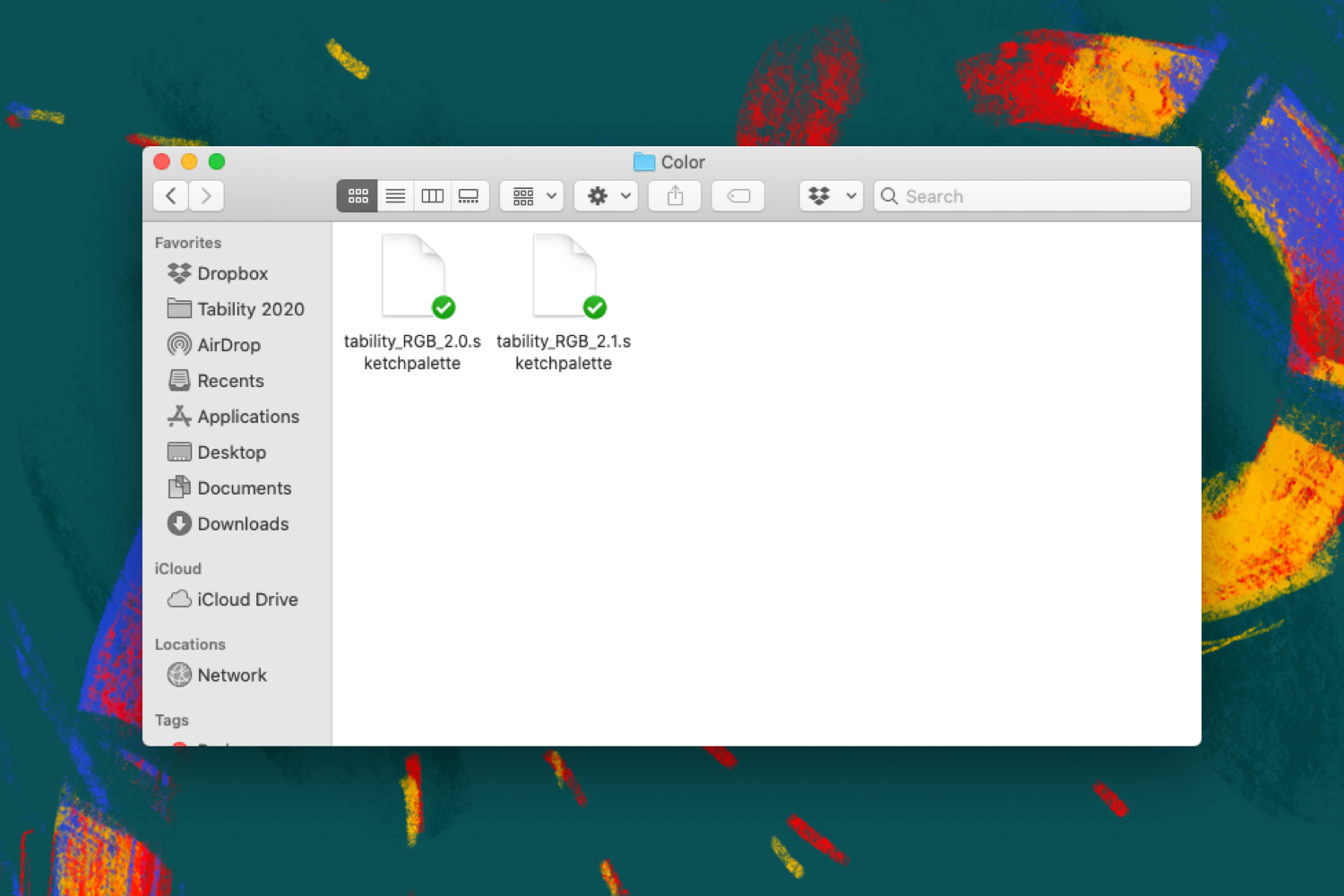
After that, using a plugin like Sketch Palettes, we created an easy Sketch palette that you can add to any file so you always start with the right colors 👇
A shared asset library
Once you start building out your basic brand assets, having an organized asset library goes a long way. Organize your folders so anyone can easily access your color palettes, your logos, your source designs, etc.
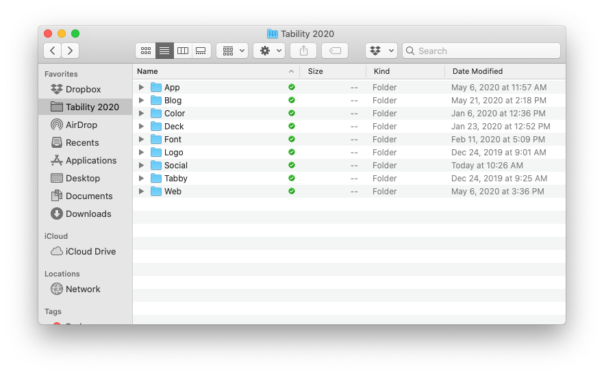
We use Dropbox, but obviously you can use whatever file sharing you use. This is such a simple thing, but it's so important. Just organizing and naming folders goes a long way and makes it so you don't have to go hunting every time someone needs an asset.
Think of everything as a template
It's easy to get caught up in the hustle of a start up and start building thing ad-hoc. The key to making your design work scalable is to think ahead so that everything you design is reusable. Think of everything as a template.
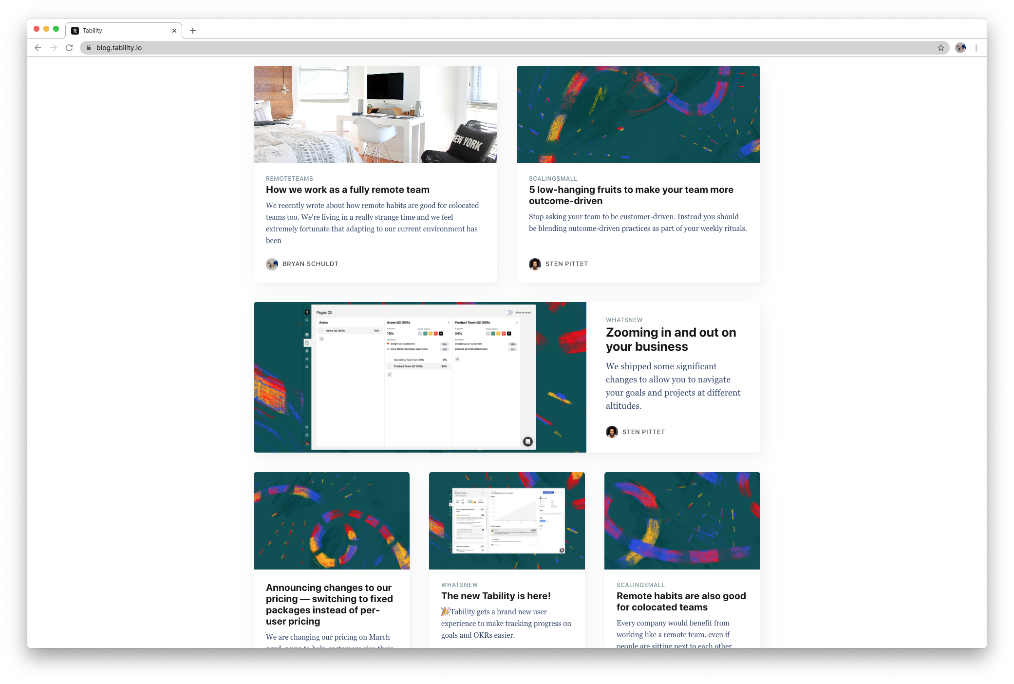
If your company posts a lot of content, you're going to need a lot of blog images and social images. Rather than creating a custom image for each post, think of a repeatable set of images or a image library you can use. For our blog posts, we created a set of patterned images that can be used for any type of content when needed. We also sprinkle in images from royalty free stock image sites, like Unsplash, just to keep the TL more engaging.
Thinking about how this asset may get used again, allows you to design everything with the flexibility of new content and new use cases in the future.
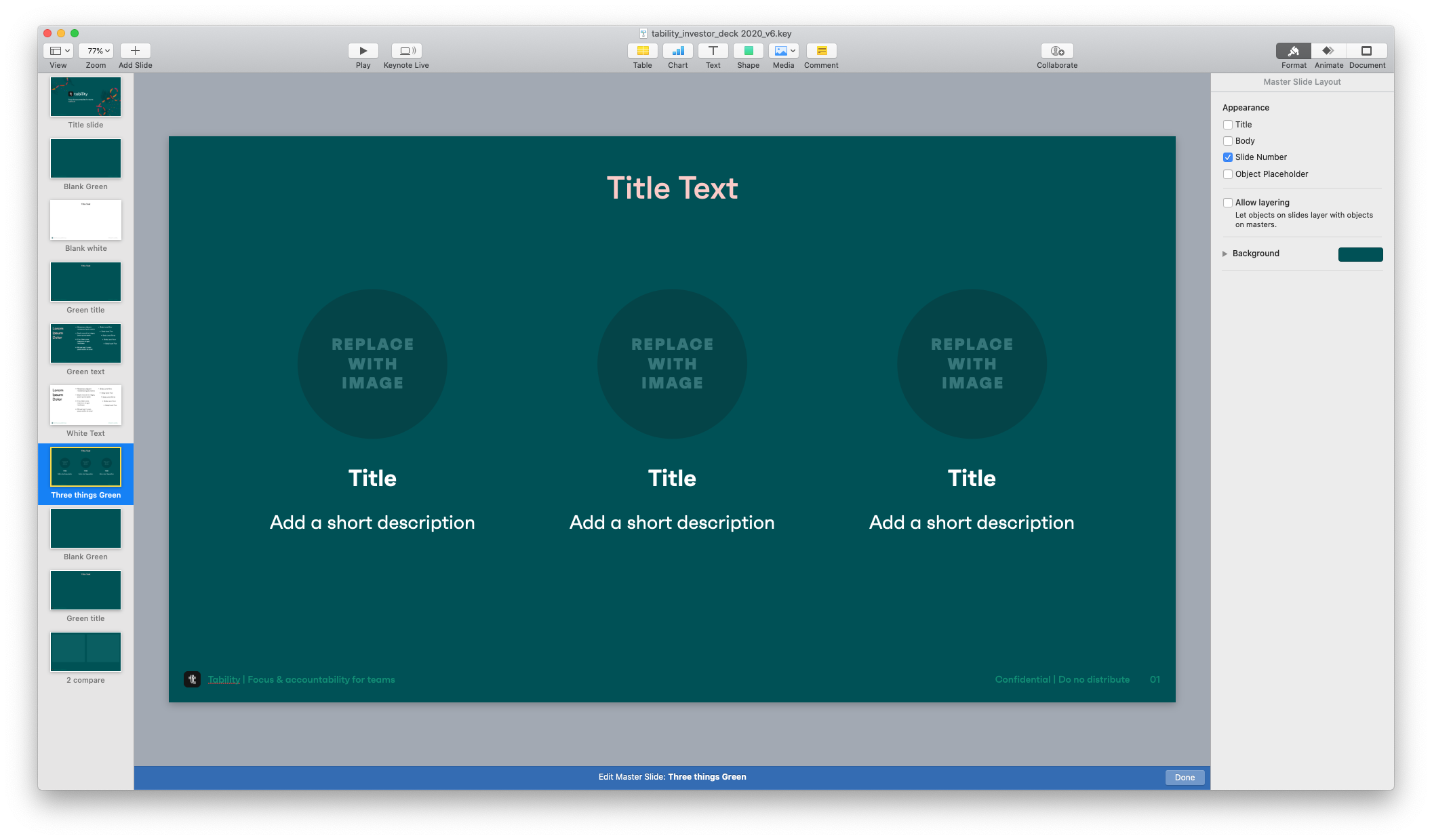
For example you will probably design a lot of pitch decks. Don't design every slide for a single purpose. You may be able to create a generic graph slide, or value props slide, and allow the content to be interchangeable in the future. As a start up that content is going to change a lot and it's important that you don't do all your work twice!