The new Tability is here!
🎉 Tability gets a brand new user experience to make tracking progress on goals and OKRs easier.

Over the past few weeks we have collected feedback from users to understand the best way to improve Tability. Today, we're shipping our most significant change to the user experience. Read below to see what's new.
Page view

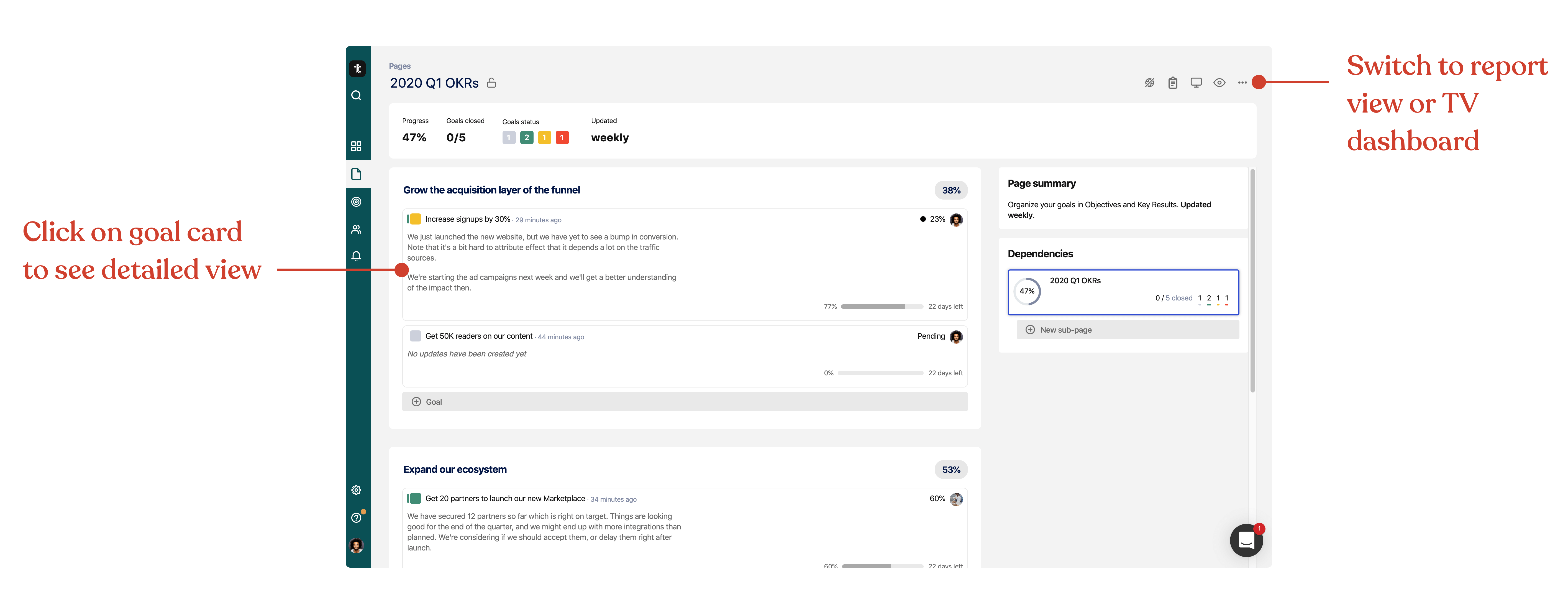
- Goals are now displayed as cards. You can click anywhere on the goal card to access the detailed view.
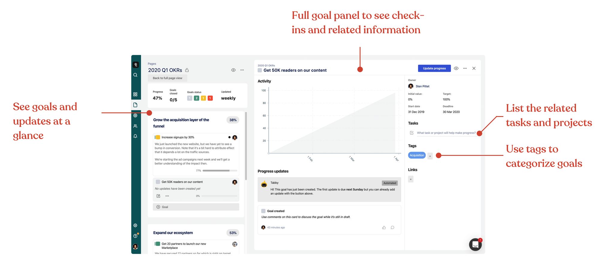
- You can read the latest updates from the page overview without having to navigate to each goal.
- Use the button in the top-right corner to switch to the report view or the TV dashboard mode.
- Sections now display the overall progress percentage of their goals.
Goal details

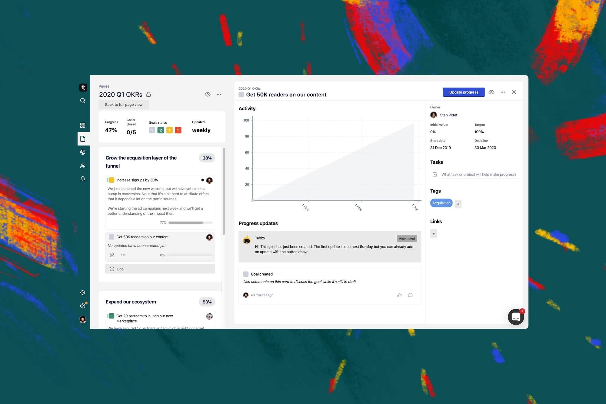
The new goal details view lets you see more about the check-ins and related content.
- There's more space for the chart to see progress.
- See all the related tasks and projects.
- Use tags to group goals across pages.
- Add links to relevant docs and resources (note that we automatically detect links in comments).
Check-in form

Tability is here to help you see how your work impacts your success. This is why we have changed our check-in forms to make it easy to add and update tasks while sharing progress on your goals.
We want you to be able to answer these 2 questions at once:
- Are we on track?
- What should we do next?
Send us feedback!
You can send us feedback via the messenger pop-up, but we also have a Slack community where you can chat with us and other users.

