A simpler way to tell you what's new
We're making feature announcements less intrusive while keeping them easier to find.

A couple of weeks ago, we stopped sending feature announcements via email. You already get a lot in your mailbox, and we want to focus on content that is relevant to the way you work, rather than being specifically about Tability.
But we still want you to know what we've been up to — this is how you can take full advantage of the platform.
Help in the navbar

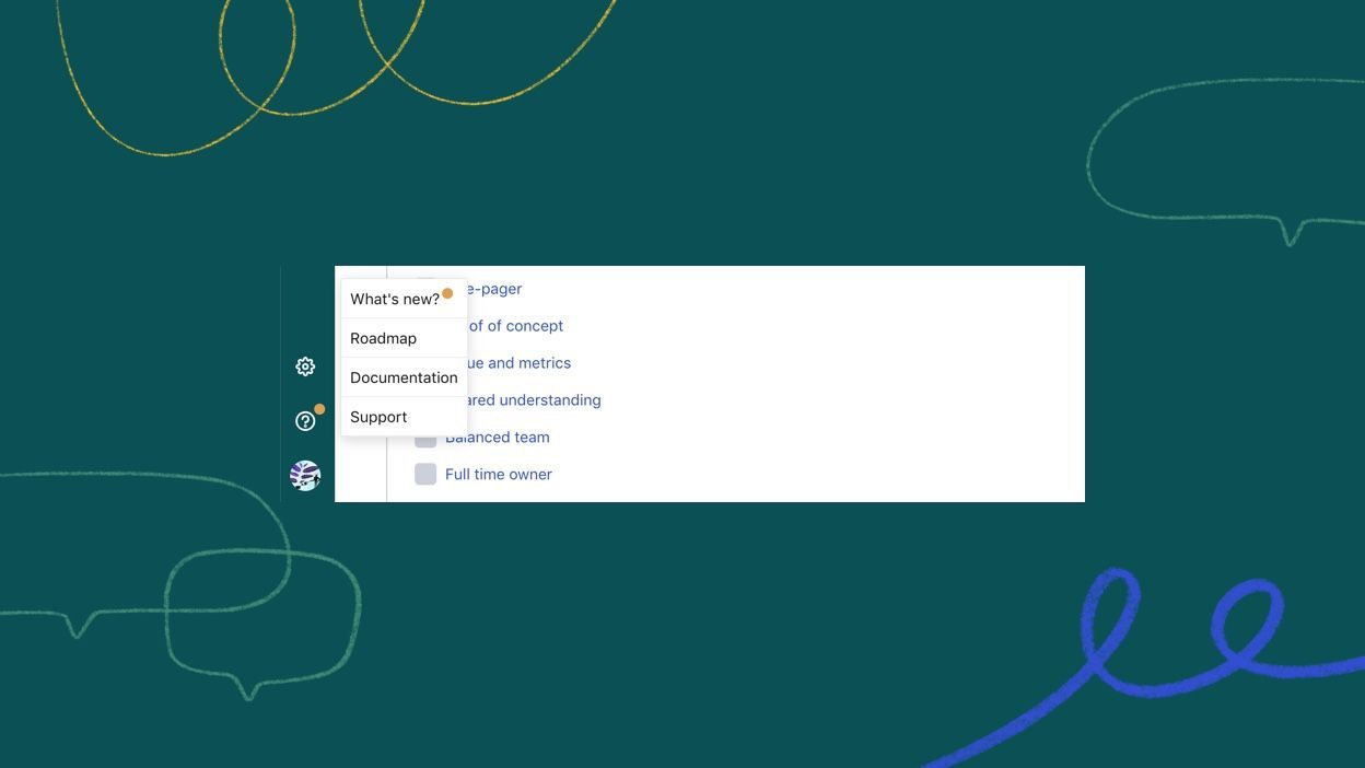
You can now find a help section in the left nav:
- What's new: find out about the latest features.
- Roadmap: see what's coming up and give us feedback.
- Documentation: learn more about how you can use Tability.
- Support: get in touch if you need help.
Less intrusive, more relevant
We love Intercom, and it's great for support, but we're moving away from using it for announcements. I'm just not sure that you want to keep seeing my face popping up in the middle of your work. More importantly, there wasn't an easy way for you to find it back old announcements if you missed them (did you know that we have 2-factor authentication?).
Now, you'll see a discreet yellow circle next to the help icon when we have new things to share. If you click on the "What's new?" link, you'll be taken to our blog where you can see all previous announcements.
Keeping things in context
Those are small things, but we believe that giving you the right information in the right place will improve your experience. Don't hesitate to email us at team@tability.io if you have feedback or suggestions.

