How we replaced (part of) Intercom with 100 lines of code
Designing solutions too early can be harmful. See how we let go of our initial approach to replace Intercom announcements with a bit of code.

(*ok, it was 105 lines)
We started to use Intercom the classic way: we wanted a simple way for people to reach out to us. Whether they were curious visitors or existing users, Intercom gave us a great way to interact with folks and have rapid feedback.
So, to be clear, we love Intercom ❤, and they're an inspiration in many aspects.
But we started to see issues with feature announcements:
- Users would have a hard time clearing messages.
- New posts would pop up in odd situations.
- It wasn't possible to find old announcements if you missed it.
I'm sure that a lot of it was due to a poor configuration on our end. But even if we got better at posting, it still would not solve the last issue.
Replacing Intercom with another solution has been a real "scaling small" exercise. We wanted to be able to keep moving fast and letting users know about improvements, but we also had to manage costs — we could not justify spending more than a couple of days on an alternative.
Looking for a better solution
I've been burned several times jumping straight into code, and I learned the hard way that you should step on the brakes first if you want to cross a wide road.
We have a simple way to evaluate options when we're about to build something significant. First, we look at the core capabilities:
- Customers can learn about new features.
- Customers can find old announcements.
Then we list some constraints:
- Less intrusive
- Cheap implementation costs
- Low management overhead
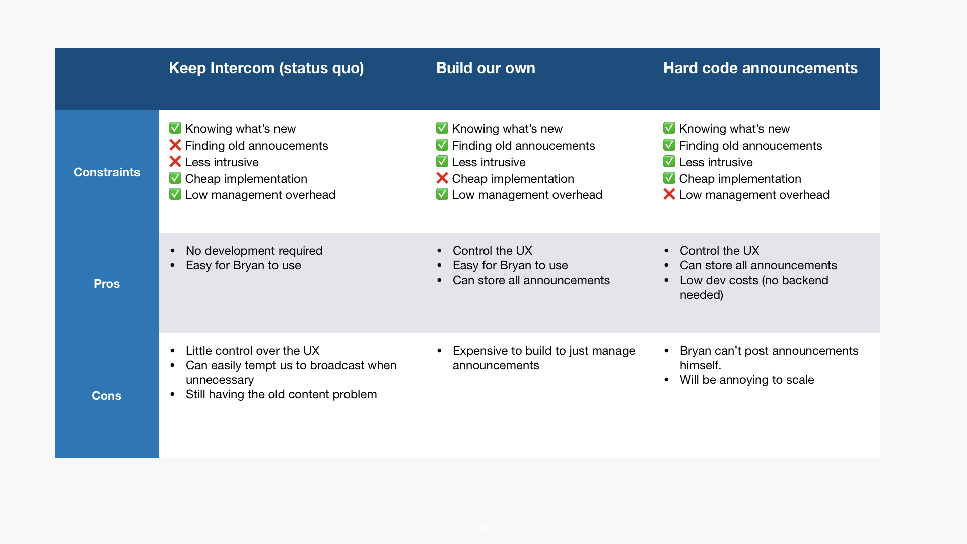
These 2 lists are enough to start outlining options. It's crucial to add the status quo as the first option because you need to make sure that you're improving things. If you just compare a set of new solutions you risk picking an approach that might degrade the current experience.
So, here's what the first set of options looked like:
- Keep using Intercom (status quo)
- Hard code announcements
- Build our own announcement feature
I put them in a table and made a quick comparison to see if option 2 or 3 would be satisfying.

None of the proposed solutions were satisfying. Hardcoding posts would be super annoying to manage, and building a full service was way too expensive.
We kept looking around for inspiration, and, not without a bit of irony, the answer came from Intercom itself.
The lightbulb moment 💡: using what we had
The goal was to let customers know about new features — nothing more. But we were so focused on the current experience (everything in-app) that we did not look for a different approach.
Well, Intercom has a small bell icon in their navbar for feature announcements. It gets a red dot when there are new things to read about, and clicking on the bell takes you to their blog. No intrusive popup, no messages to dismiss.

That was perfect.
All our feature posts were already on our blog, and this is where customers could also find old posts. So we just had to send them there to read about what we've done to improve Tability.
No backend required to manage posts. No need to create a fancy listing in the UI. We just needed a way to show that new blog posts had been posted.
That was done simply by using localStorage to capture the last time they clicked on the link to the blog. Sure, the notification would pop up again if you switched browser for the same account, but that's still an edge case right now (but we'll fix that later).

105 lines of code later
We're pretty happy with the result and we will iterate on the implementation to improve it:
- We still have to store the timestamp of the last blog update somewhere in on frontend (we deploy multiple times a day so still manageable).
- Having the notification popping up again in different devices will end up being annoying when we launch our mobile app.
It's not what we originally had in mind, but it does the right job: reducing noise while letting users learn about improvements.
The lesson learned? Focusing on what the customer needs to do, rather than the experience you want to ship lets you be more creative.
(105 lines could have been shorter, but Redux...)

