It's not just what, it's also when
Sometimes we give our users all the right answers at all the wrong time. It took us a while to realize this, but we got there.

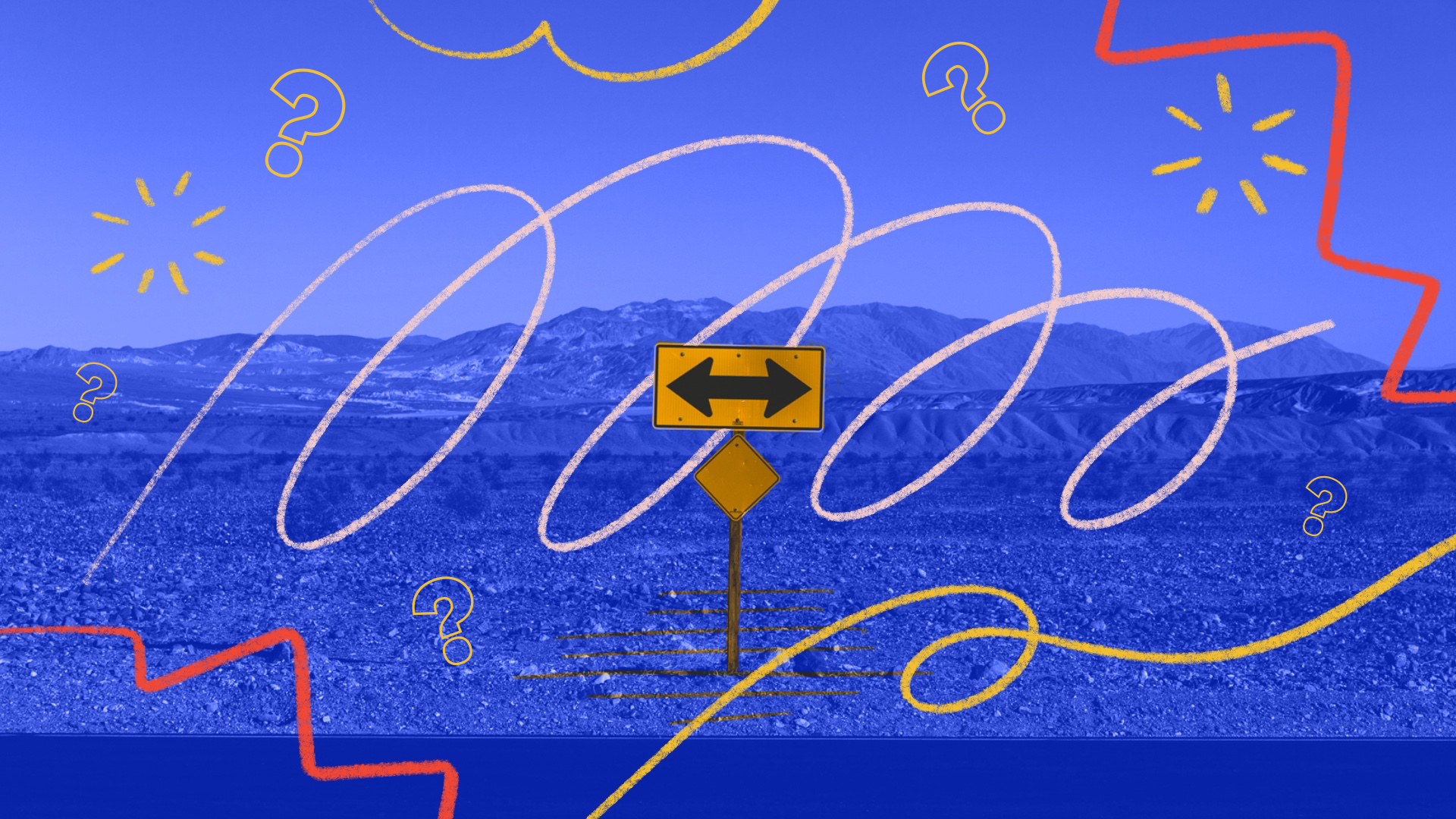
Road signs; where you place them matters just as much what it says. If you place a "right turn only" sign where there are no turns anywhere to be seen, it's likely that the sign will be ignored, or worse, create confusion. Maybe someone would take a right turn, veering straight off the side of the road.
The same is true about UX.
Giving your user all the right tools to succeed is important, but completely useless if the user is seeing those tools when they don't need them.
We found this out in a recent redesign of our page creation flow. In the product, you have pages, which house goals. When you create your first page, you're presented with either a blank page with no further directions, or a template page filled with example content you've never seen before. Choosing between a blank page and a template page is the very first thing that happens, even before you ever see what a page looks like.
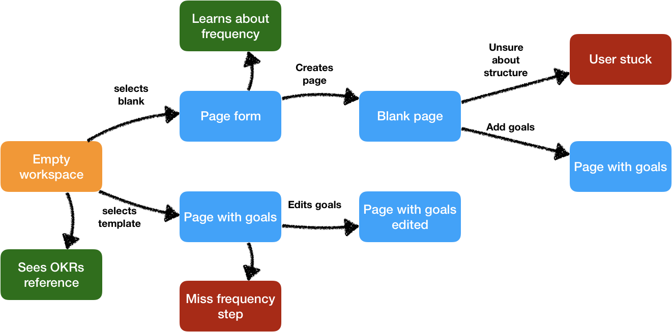
It sent users down a path, where they've decided on something before they knew what either option truly meant. So by the time they get to a point where they have no clear next step, they're way down in the process with not a clear way backwards - other than starting over from step 1 💩
We built all the right tools to help users get started, but they were confusing or not being utilized because they were being presented at all the wrong points in the journey.
We went back to the drawing board and tried to find the most logical journey, completely disregarding what we had built or what was in place now. We wanted to purely think about what the best path was, from creating your first page to creating your first goal within it, even if it meant we also had to start over at step 1 💩
We pinpointed the places where users would run into a dead end, the "what now?" points in the journey. We targeted all the help and template options in places where users get stuck and needed them the most.
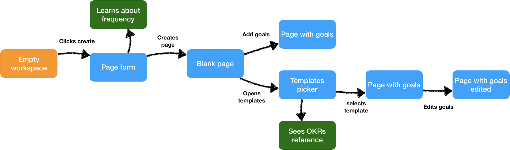
Now rather than giving people the choice of a blank page or template page before they see what a page is, the idea was that we put everyone in a blank page. From there the user can decide to just start adding goals, or seek help by adding a template when they first realize they don't know what kind of goal to add.
It seems like a small and seemingly obvious thing, but there is a huge difference between can I help you now and can I help you later? No one wants any help when they don't need it and a good service will be there immediately when the need comes up.
Small details like this are what I believe create a great UX. Above all that's what we strive for at Tability so we hope to continue to have these learning moments, and find new ways to improve. If you're a user of our product, you can check out our improvements live in Tability now. If you have more UI or UX tips for us, or notice any ways we can improve it, please let us know – comment or email us at support@tability.io!
✌️