Trends and progress in your OKR dashboard
New updates to your Plan Dashboard. Get insights, trends and charts in context with all of your plan data.

Alright, let's keep it straightforward. When it comes to managing OKRs, you've got a lot on your plate – overseeing teams, hitting goals, the whole shebang. That's where a solid dashboard comes into play – something that's not just a bunch of numbers but a visual guide that actually tells you something useful.
So, what makes a good dashboard? Well, it's got to be quick, easy to understand, and of course, it should show you things you might have missed.
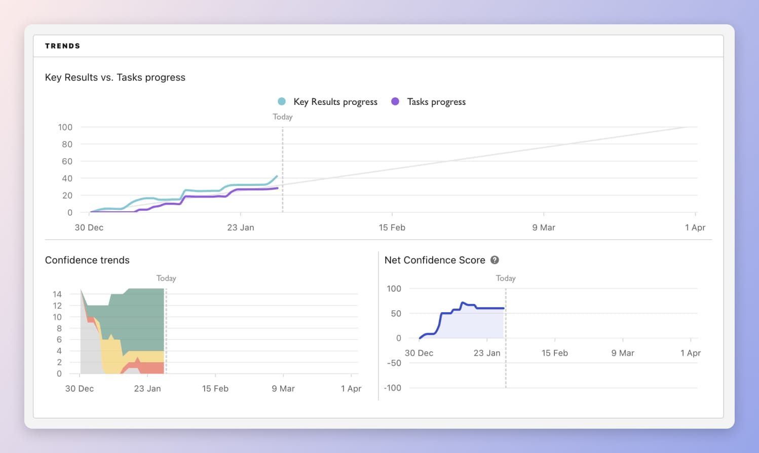
This week, we gave a fresh look to the Plan dashboard, the place where your OKRs and goals hang out. It still does all the usual stuff – helping you plan, track, and execute. But now, we've spiced things up by adding more data. Now you can see charts and graphs that show your team's overall progress and confidence, all in one place.
We'll dive into more about this new feature and more. Let's go 👇
New Tability Features
Here are all of the latest releases in Tability.
New insights metrics on your plan dashboard

We've just launched a new design of the plan dashboard, and brought in the same view progress status and insights.
Your new dashboard is organised in 5 sections:
- Overview: General stats about your plan
- Details: See detailed updates about your goals
- Trends: Track the evolution of progress and confidence over time
- Insights: Keep an eye on the items that require your attention
- Sub-plans: Take a look at the data in your sub-plans
With all of these new sections added into one view, you can now glance across all the data for a plan in just one scroll, keeping everything related to your plan in context.
Go to your workspace to check this out now!
Improvements
Our team has been going through a sweat-the-details spike to polish existing features and improve your experience. These improvements range from tiny design adjustments to completely rehauled features.
Fixed
- Updating the owner or status of initiatives properly reloads the data
- We fixed the empty state of the outcome panel in your focus page (it previously said you did not have any outcomes when check-ins were due)
- We fixed the size of the tasks header in the check-in edit form
- Tags selector in the outcome panel no longer break the popup width
- Clicking on initiatives in the check-in form will open up the initiatives in a new tab
Improved
- You can unsubscribe from email notifications without having to sign into Tability
- You can remove the due dates of initiatives without having to open up the edit panel
- Initiative description can now be updated inline – and has been moved just above the status updates
- Users are preloaded in the user picker to improve performance
Latest Tability Content
We write a lot. Here's the latest in our library of resources and best practices.
Tability guides
Have you checked out our new and improved Tability documentation? Whether you're a beginner or an expert with our software, there's bound to be a trick or tip that you weren't aware of.
Since we get asked about this a lot, here's a great how-to on proper alignment and cascading of goals in Tability:

Feedback?
Let us know in the comments or send us a message to tell us what you think of the new features? What can we improve?
Reach us through our chat on our website, or email us at team@tability.io 💬


